NAVI App:
Salon Finder
NAVI is an app designed to help users locate nearby salons and offer virtual consultations with professionals.
Project Type
Fictional
Responsibilities
UX Research
+ UI/UX Design
+ User Testing
Project Duration
January - May 2024
Tools
Figma
Challenge
Finding local salons in unfamiliar areas is challenging, and customers often remain unsure if the chosen salon meets their needs until their appointment. How can I create a digital platform to help locate salons and offer virtual consultations with professionals, ensuring customer needs are met and providing a positive experience.
Goal
Develop a solution that makes it easy to discover salons regardless of location, with features catering to the needs of users with busy schedules for a user-friendly experience.
Affected Population
Individuals aged 21 years and above.

01
Research
02
Ideation
03
Design
04
Testing
05
Reflection
Research
01
To better understand how Navi can increase customer experience and customer engagement, I devised a comprehensive research plan. My preliminary findings revealed that customer engagement and loyalty is driven by hassle free experiences such as online booking, salon finding, and video conferencing.
Mobile booking applications enhance salon operations through streamlined appointment management, 24/7 online booking, automated processes, and improved customer engagement and loyalty.
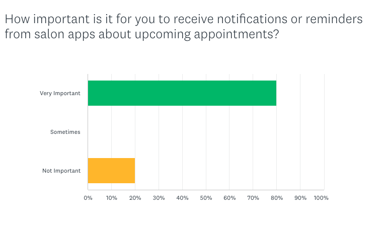
60% of salon appointments are made outside of regular business hours.
Technologies like video conferencing and digital assistants have revolutionized the shopping experience, allowing businesses to meet immediate consumer needs and maintain customer satisfaction.
Consumers expect immediate results and personalized experiences; if they do not receive these, they will abandon their search or purchase.
Geolocation services are vital for mobile users, as they use GPS and Wi-Fi to pinpoint locations, find nearby businesses, streamline navigation, enhance personalized interactions, and improve customer experiences.
The ability to locate a business or get directions from a user's current location saves time, reduces stress, and attracts more customers.
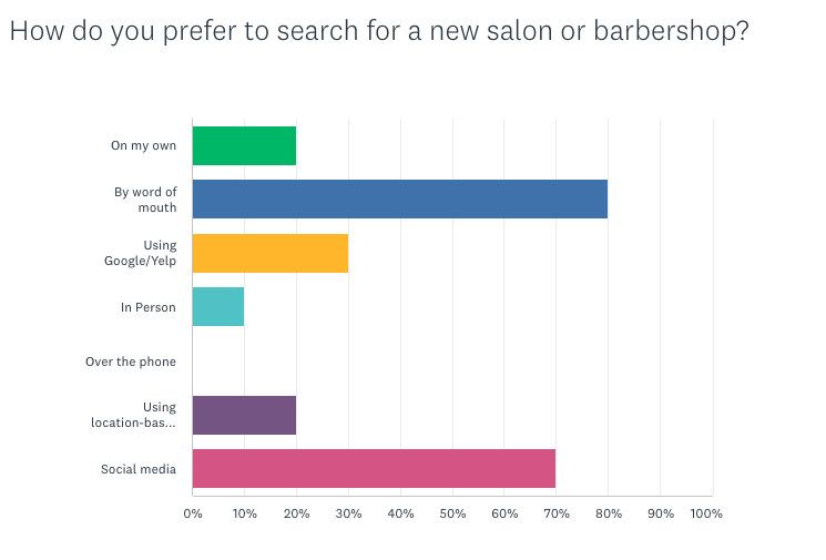
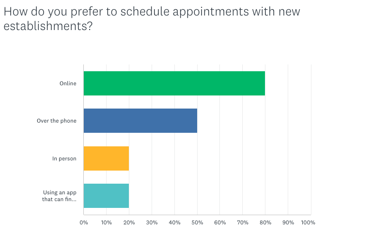
To gain insight into other salon programs and how they operate, I conducted a design analysis to understand better what it would take for Navi to succeed and separate it from other software programs that exist today. I employed surveys to gain insight into what influences how users find new salons. I used my findings to produce affinity maps, empathy maps, and personas. These tools helped me gain a deeper understanding of user behavior and design an app that caters to their needs effectively.
Primary Research
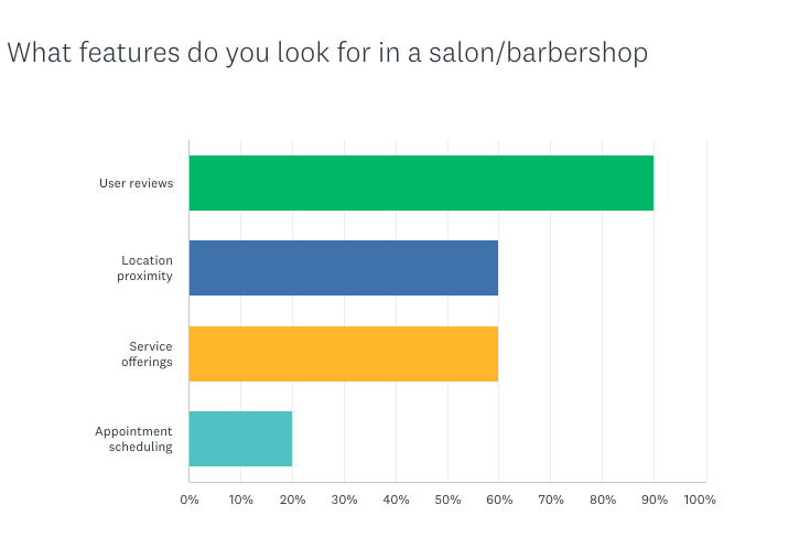
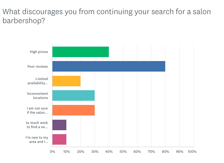
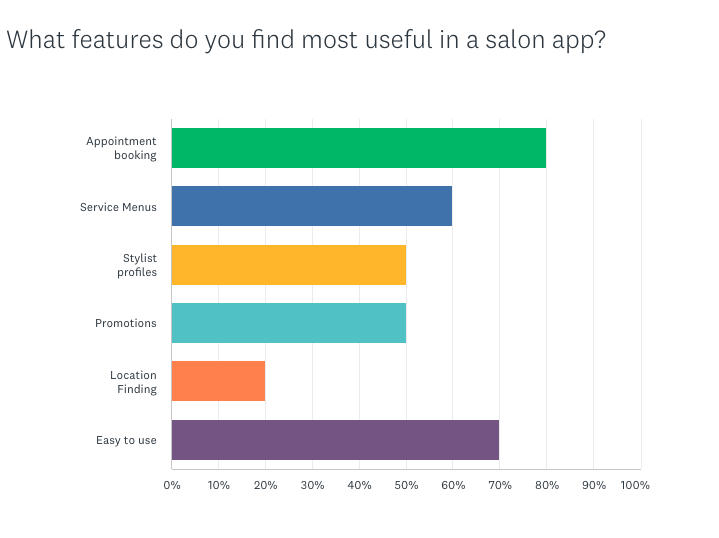
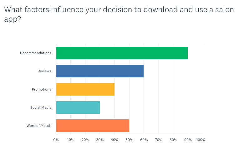
The main objective was to understand factors influencing users’ decisions when choosing new salons, including location, salon accessibility, and features. I built an online survey using Survey Monkey and shared it on various social media platforms. I received 41 anonymous participants of all genders ages 21 and over.
Surveys


Affinity Map
With the data gathered from the surveys, I developed an affinity map based on three main themes:
Current Solutions
Challenges of finding a new salon
Important / Missed opportunities

Empathy Map
By conducting empathy mapping, I successfully developed a user persona:
The busy executive.
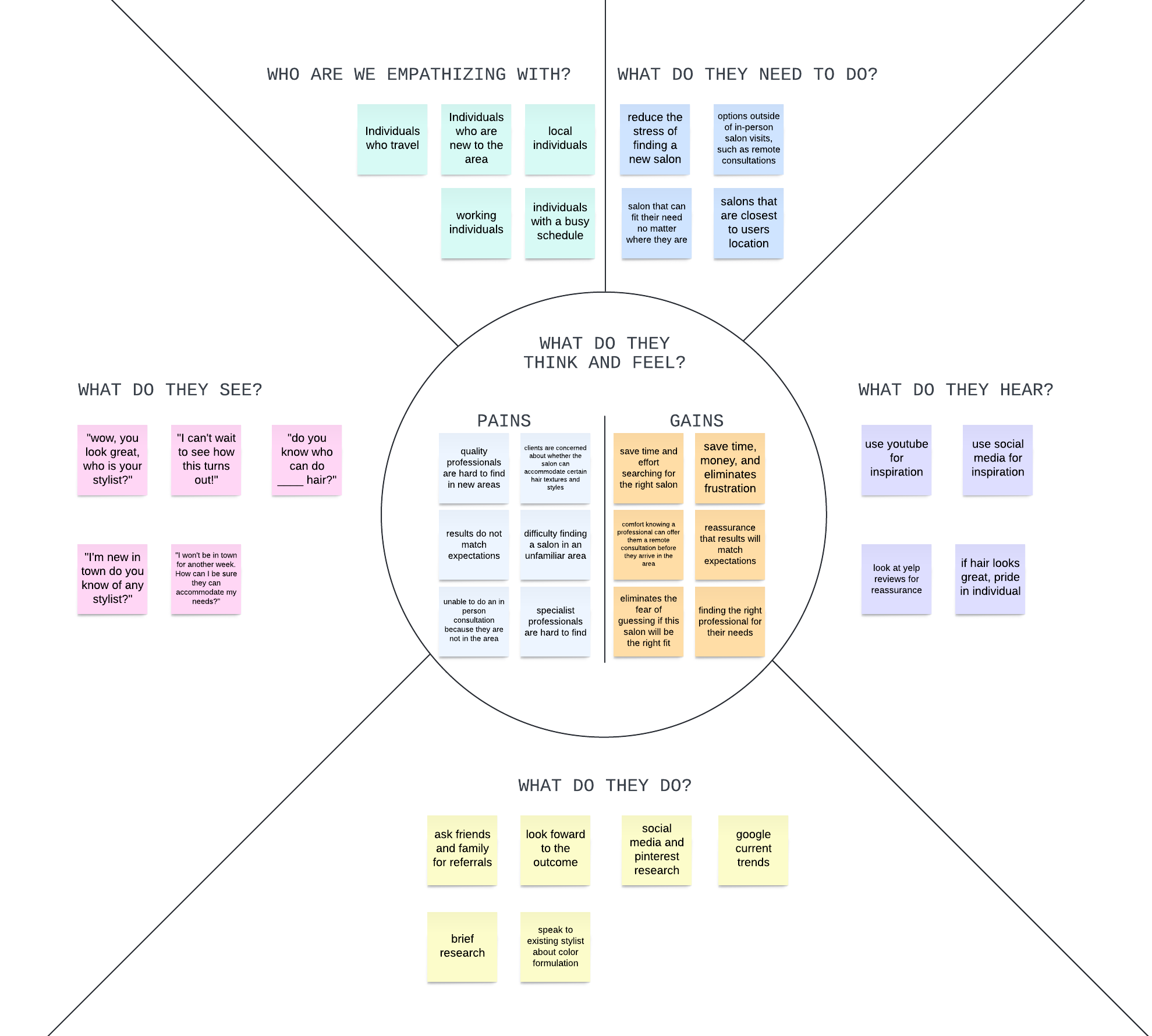

Personas
The Busy Executive
Natasha Manning
35 years old, Marketing Executive, San Francisco, CA.
Bio
Natasha leads a busy lifestyle, juggling her demanding job and social commitments. She values efficiency and convenience in all aspects of her life, including personal grooming. As someone who frequently travels to work, Natasha often finds herself in unfamiliar cities where she needs to locate nearby salons quickly and easily.
Goals
Quickly locate nearby salons while traveling or in unfamiliar areas.
Access accurate and reliable information about salon distances from her current location.
Save time and effort by using a user-friendly app for salon finding.
Find professionals that offer virtual consultations to ensure they are the right match.
Pain Points
Difficulty finding salons that can accommodate her needs while traveling.
Finding a salon close to her.
Quality professionals are hard to find.
Results do not match expectations.
Ideation
02
I brainstormed potential solutions to address the problem. Drawing from research synthesis, I sketched ideas and conceptualized approaches to tackle users’ problems.
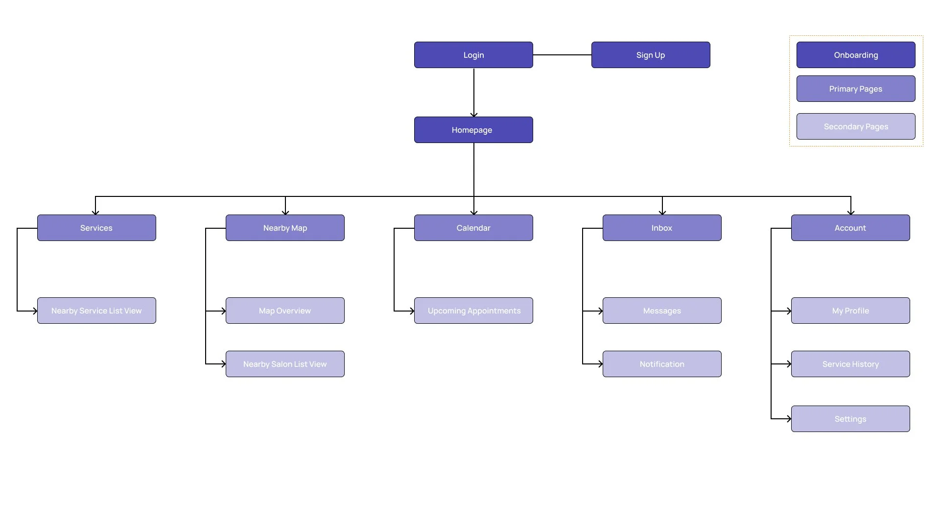
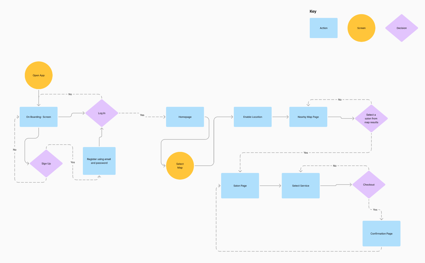
Site Map
I developed a sitemap to provide a clear and organized structure for the app, ensuring that all content is logically arranged into a simple task management system to organize what can be overwhelming into a manageable process.
User Flow
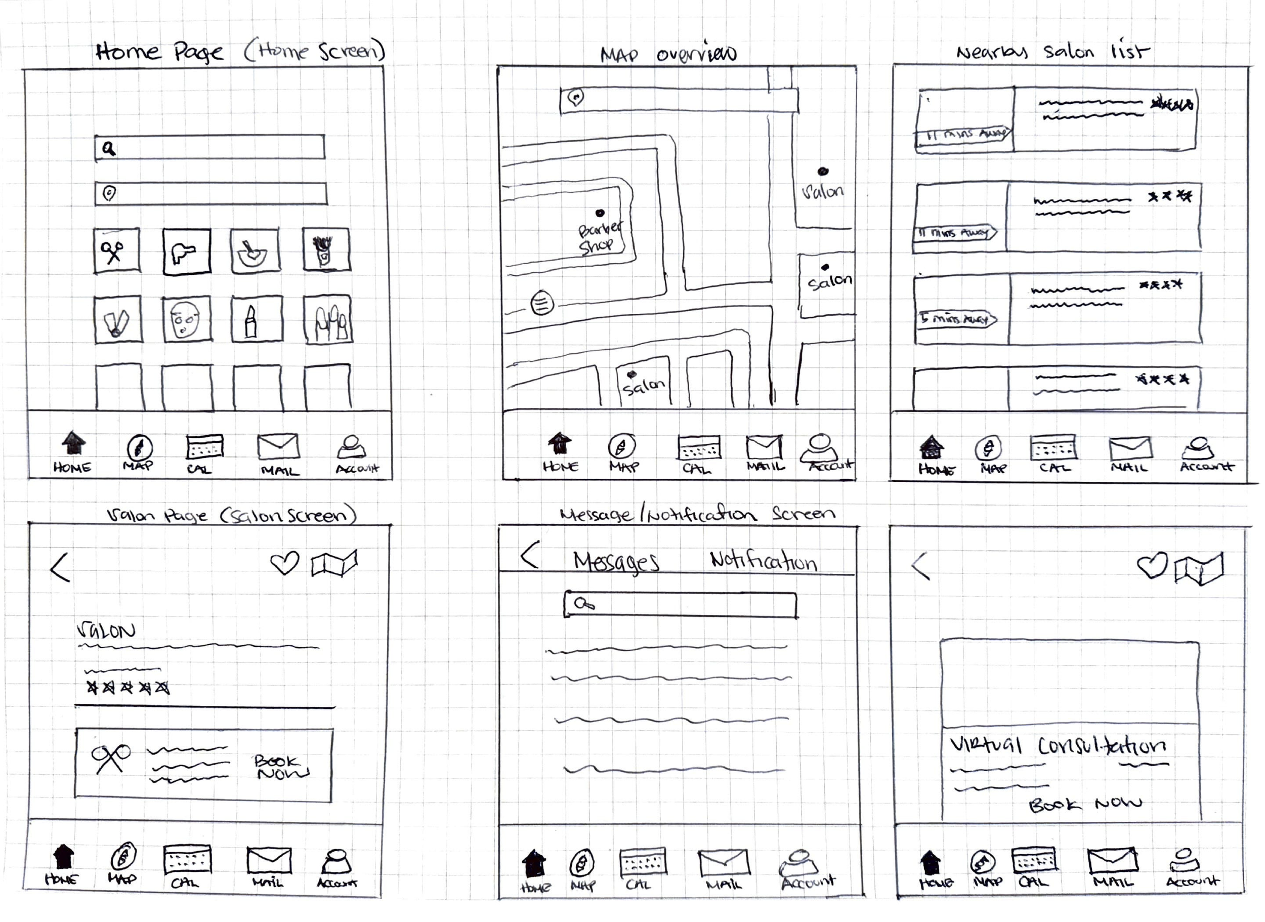
Exploratory
Sketches
Sketching is where my ideas began to come to life. I used user flows and sitemaps to draft potential screens that would provide a user-friendly experience and help users complete each task. After completing the sketches, I asked six users to evaluate them and provide feedback, which I used to refine the final design direction.
Exploratory Sketch 1
Exploratory Sketch 2
Exploratory Sketch 3
Exploratory Sketch 4
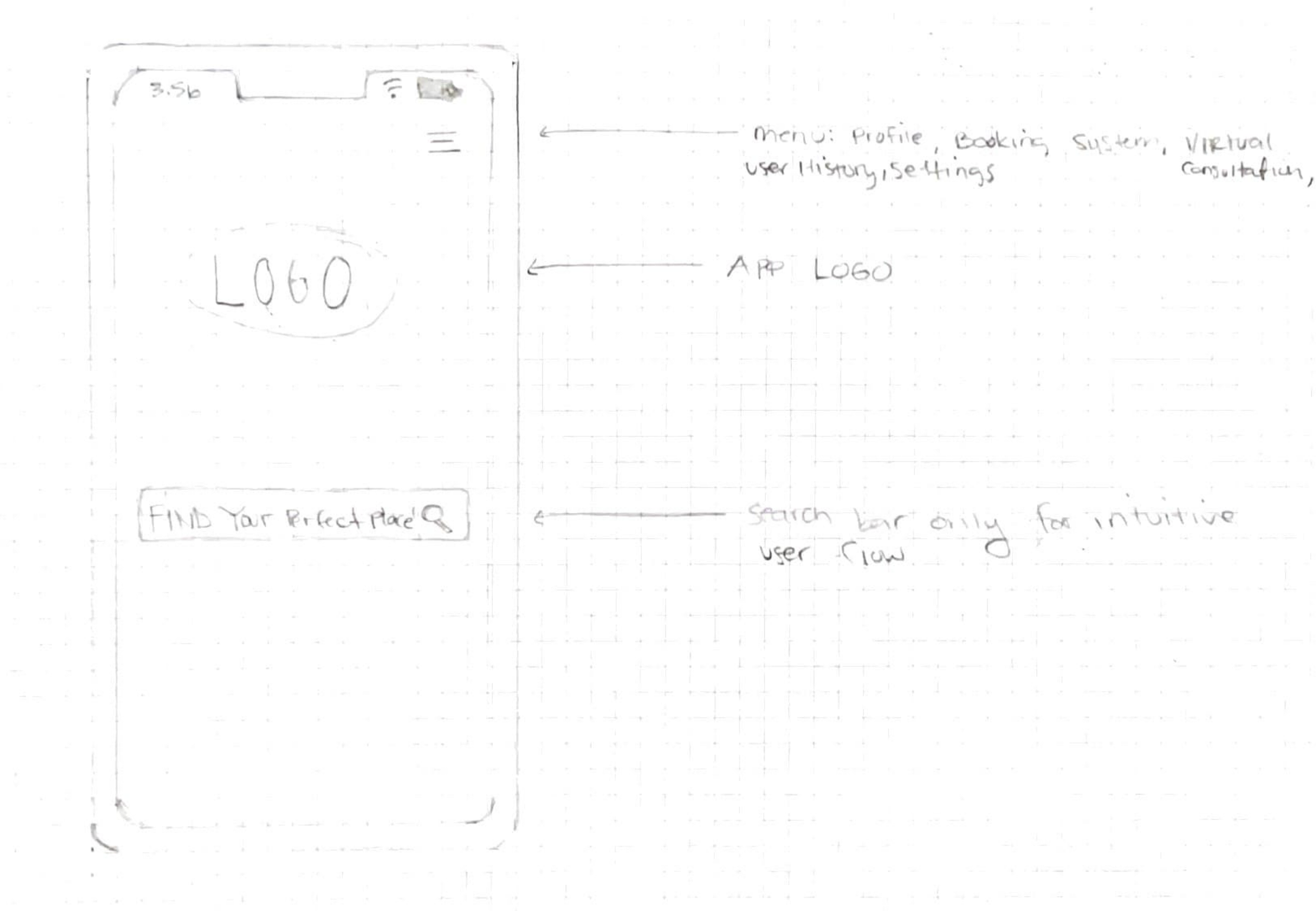
Exploratory Sketch 5
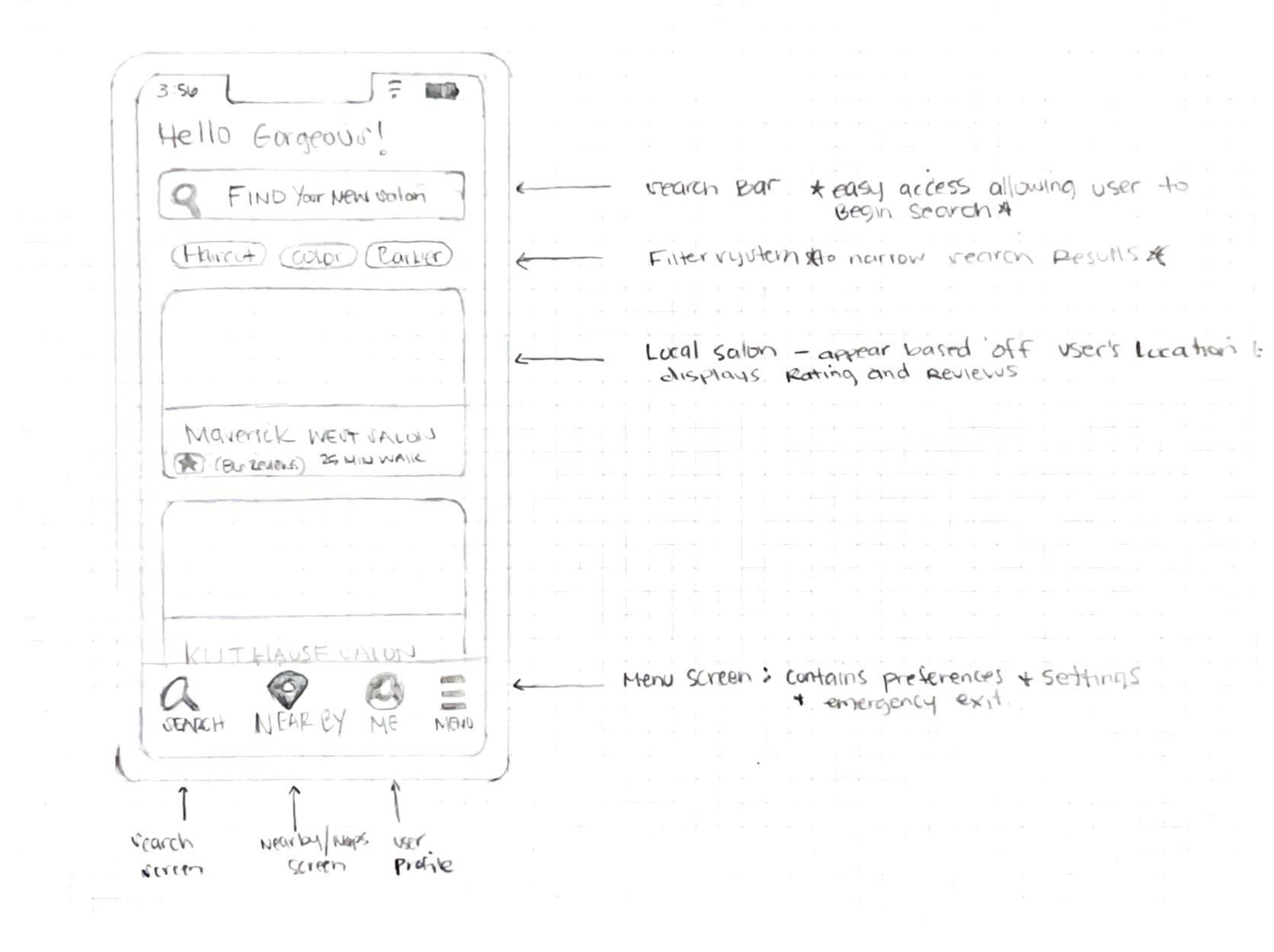
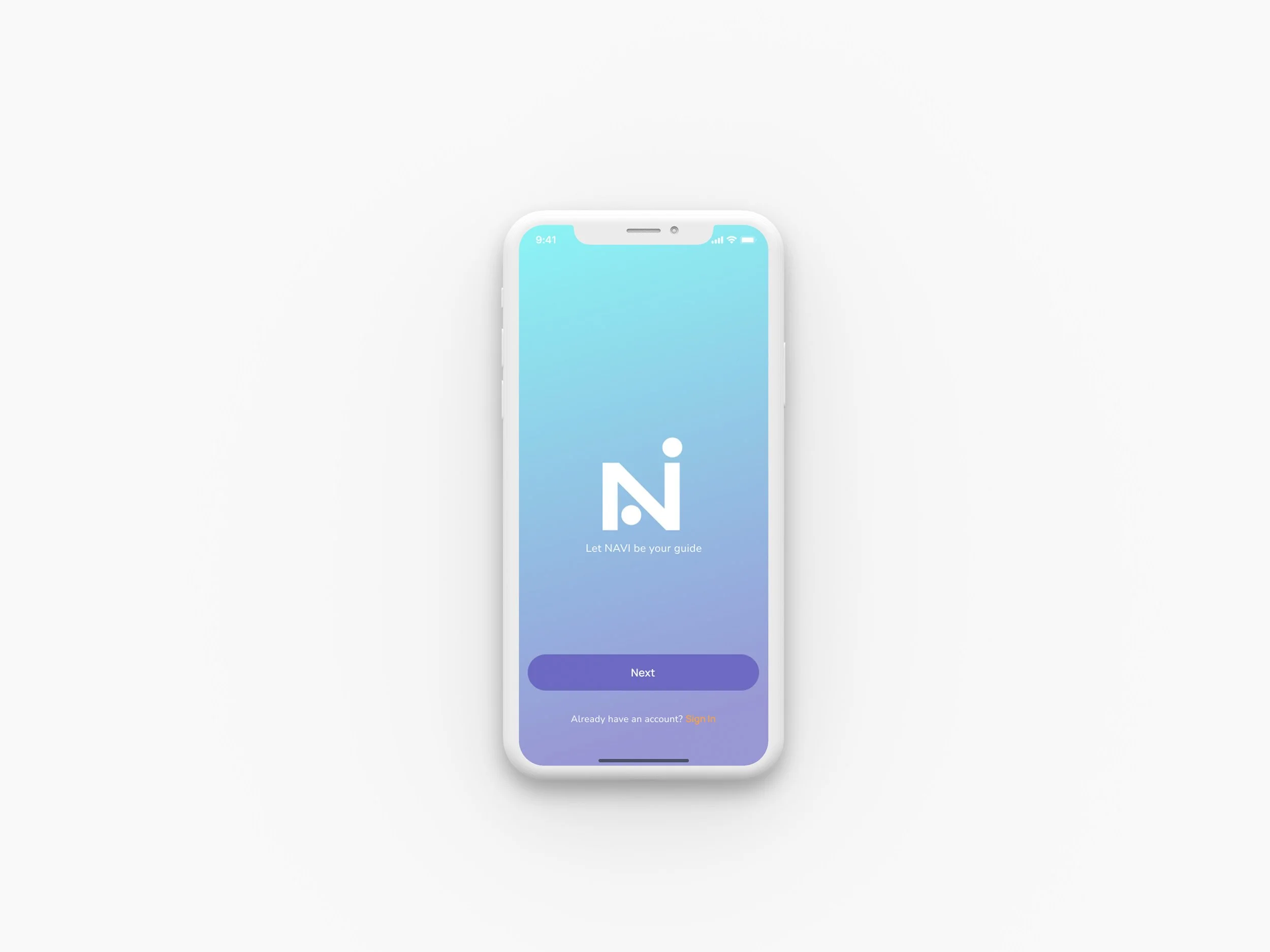
Final Design Direction
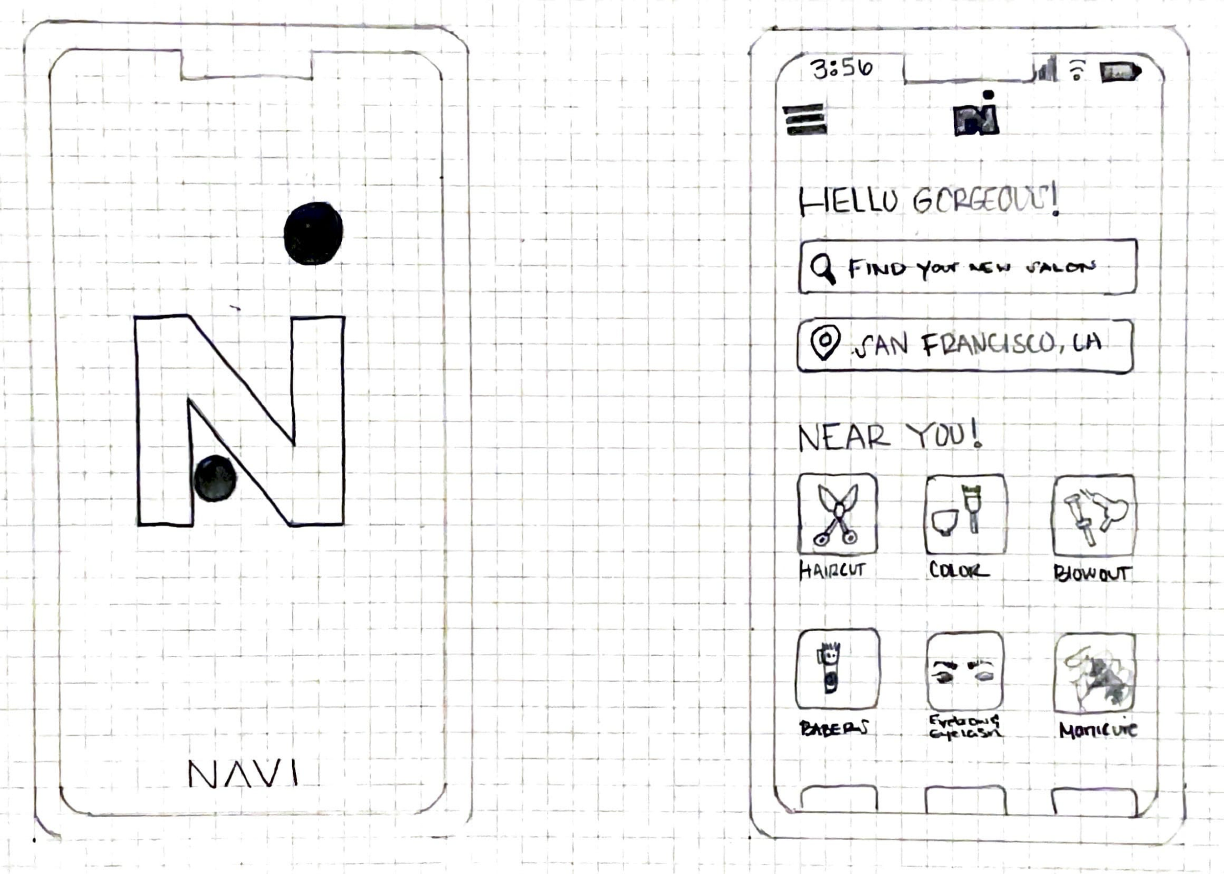
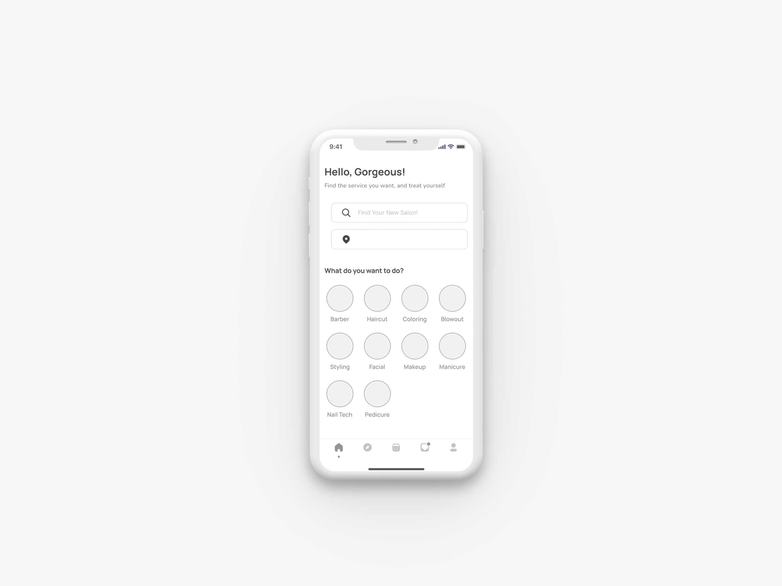
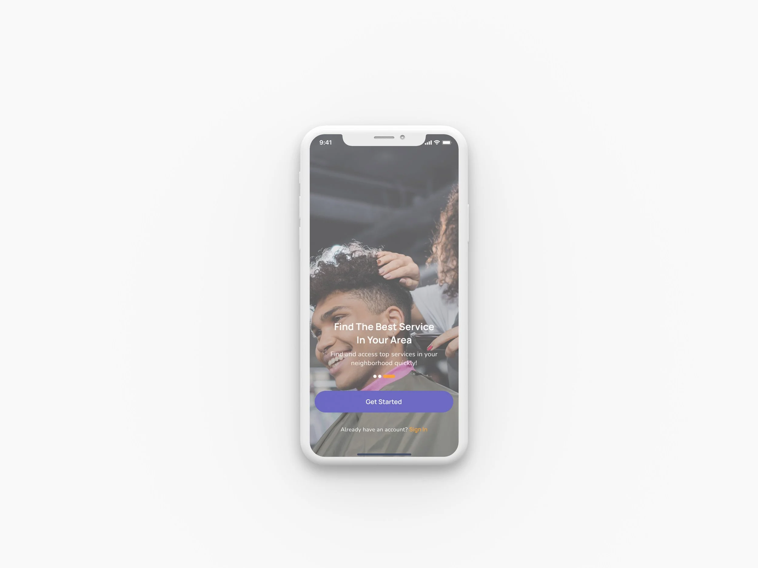
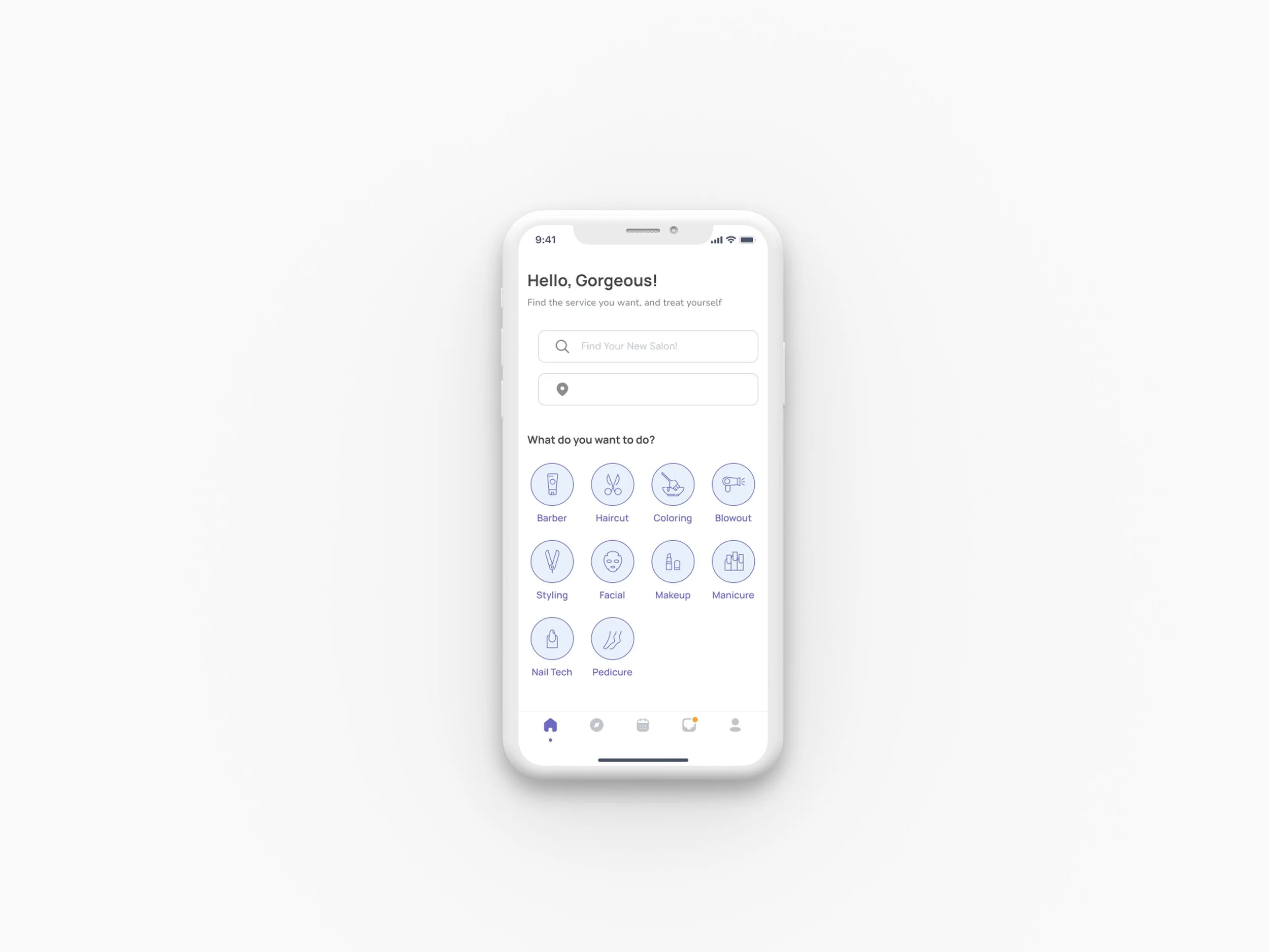
Final design direction after user evaluation - Splash screen and Home screen
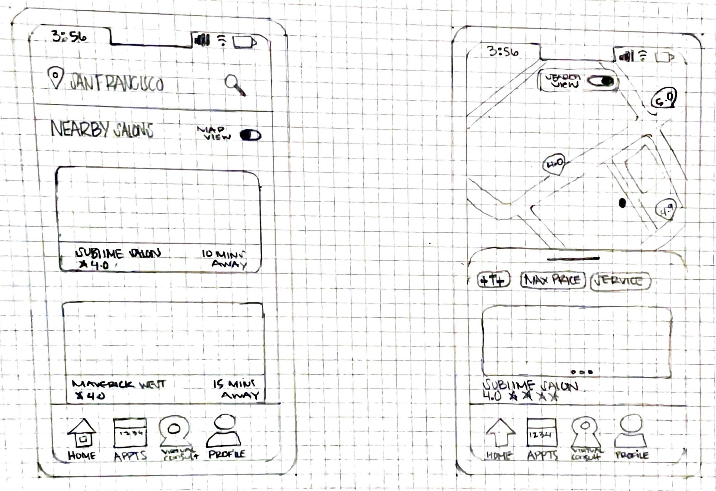
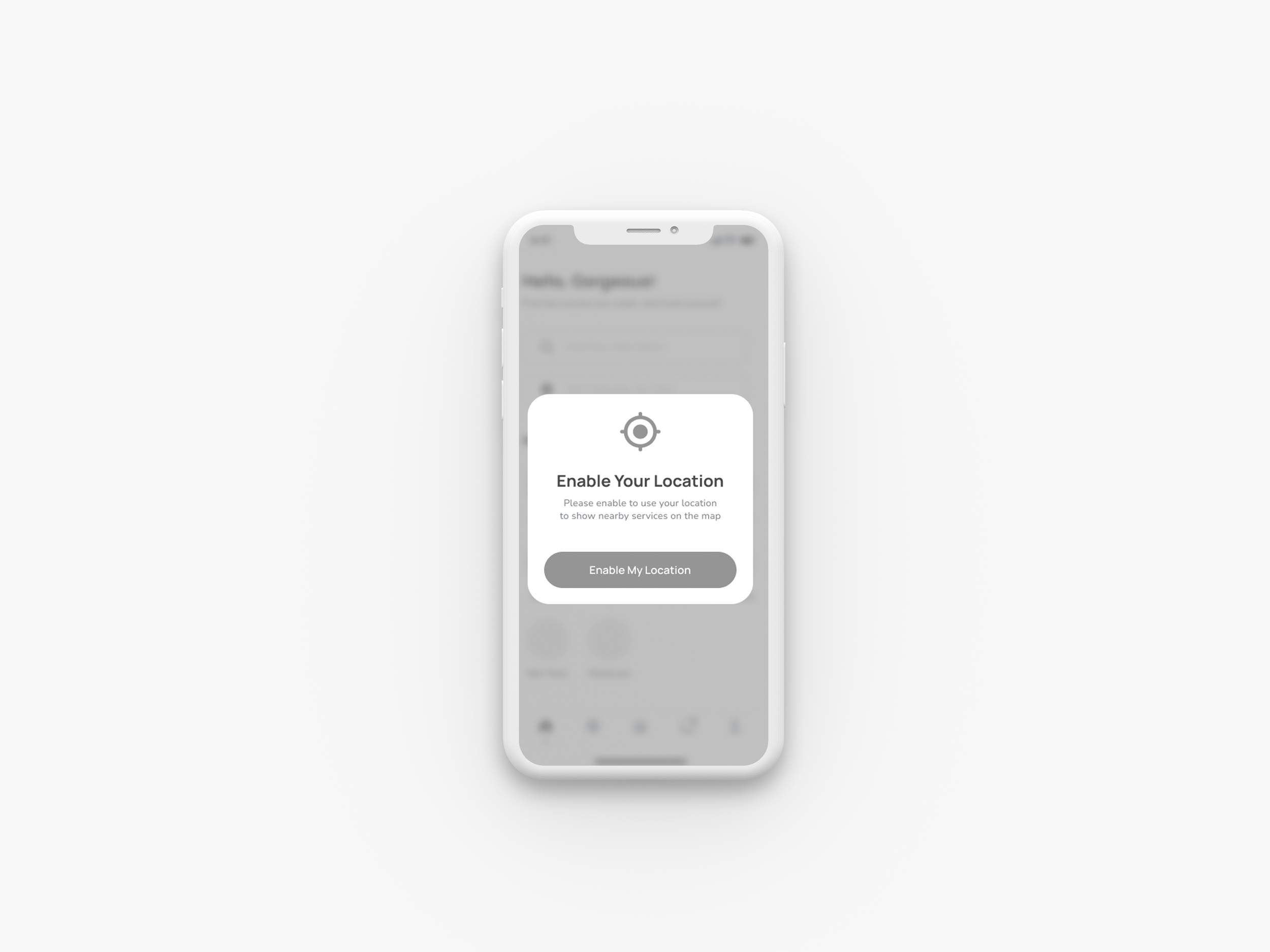
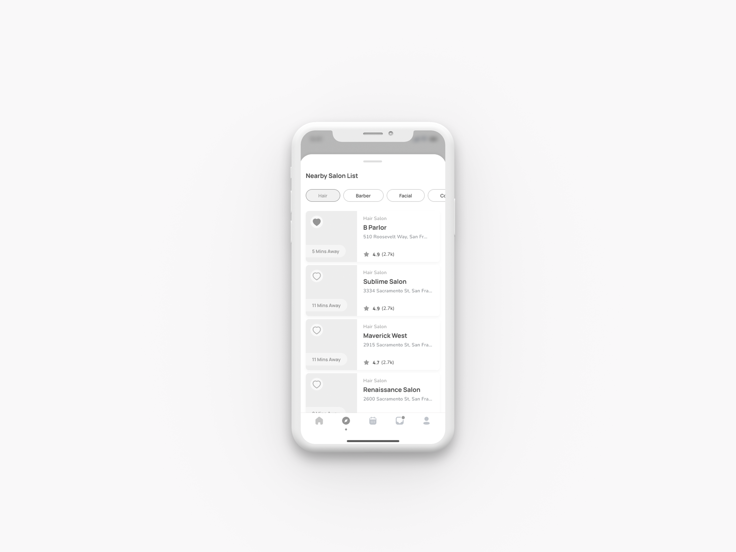
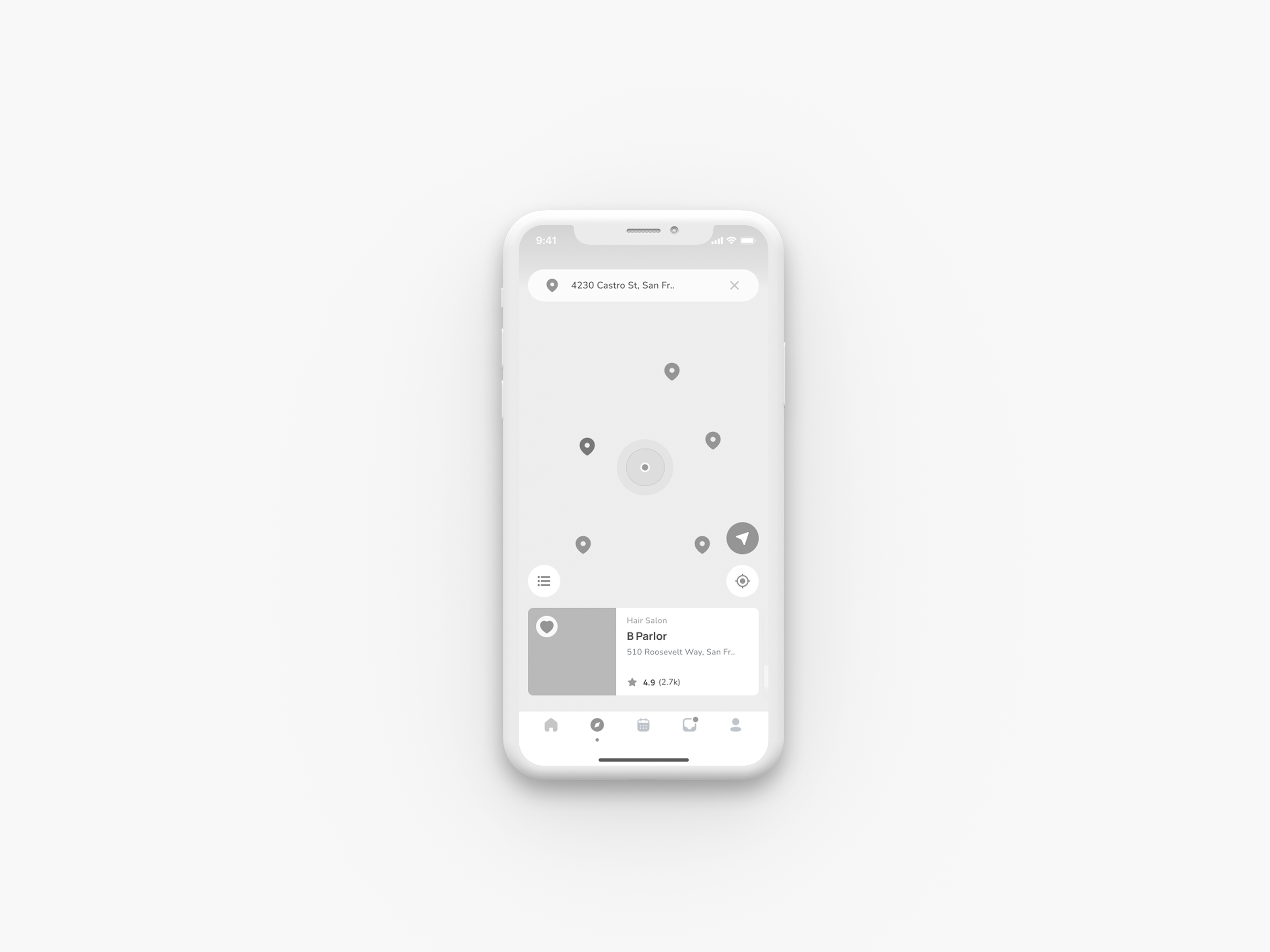
Final design direction after user evaluation - Salon list screen and Map screen
Design
03
Wireframes
In the initial round of wireframes, I iterated multiple designs for the user flow. I evaluated whether I addressed key paths by cross-referencing them with the sketches. These iterations helped me refine how I presented information and essential features. Given the home screen's detailed content, I focused on organizing it to make it easier for users to understand.
Moodboard
After conducting initial research and thoughtful deliberation on defining this brand, I focused on key qualities essential for achieving desired outcomes: reliability, user interaction, and trust that users will always be in great hands.
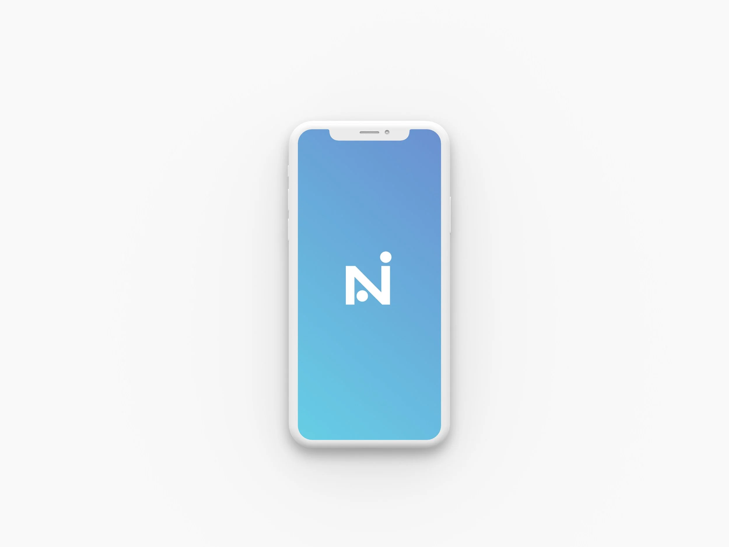
Style Guide
To establish a consistent visual language, I started creating the design system with the logo, emphasizing a clean and simplistic style. I maintained this aesthetic throughout the app to avoid overwhelming users with complexities. I chose purple and blue to reinforce feelings of trust, confidence, and reliability, which users should experience when using Navi.

To start creating high-fidelity designs, I first concentrated on the most important screens for each workflow. By analyzing color usage, I was able to pinpoint the most effective design elements. It was important to maintain a balance of content and color to avoid overwhelming the user.
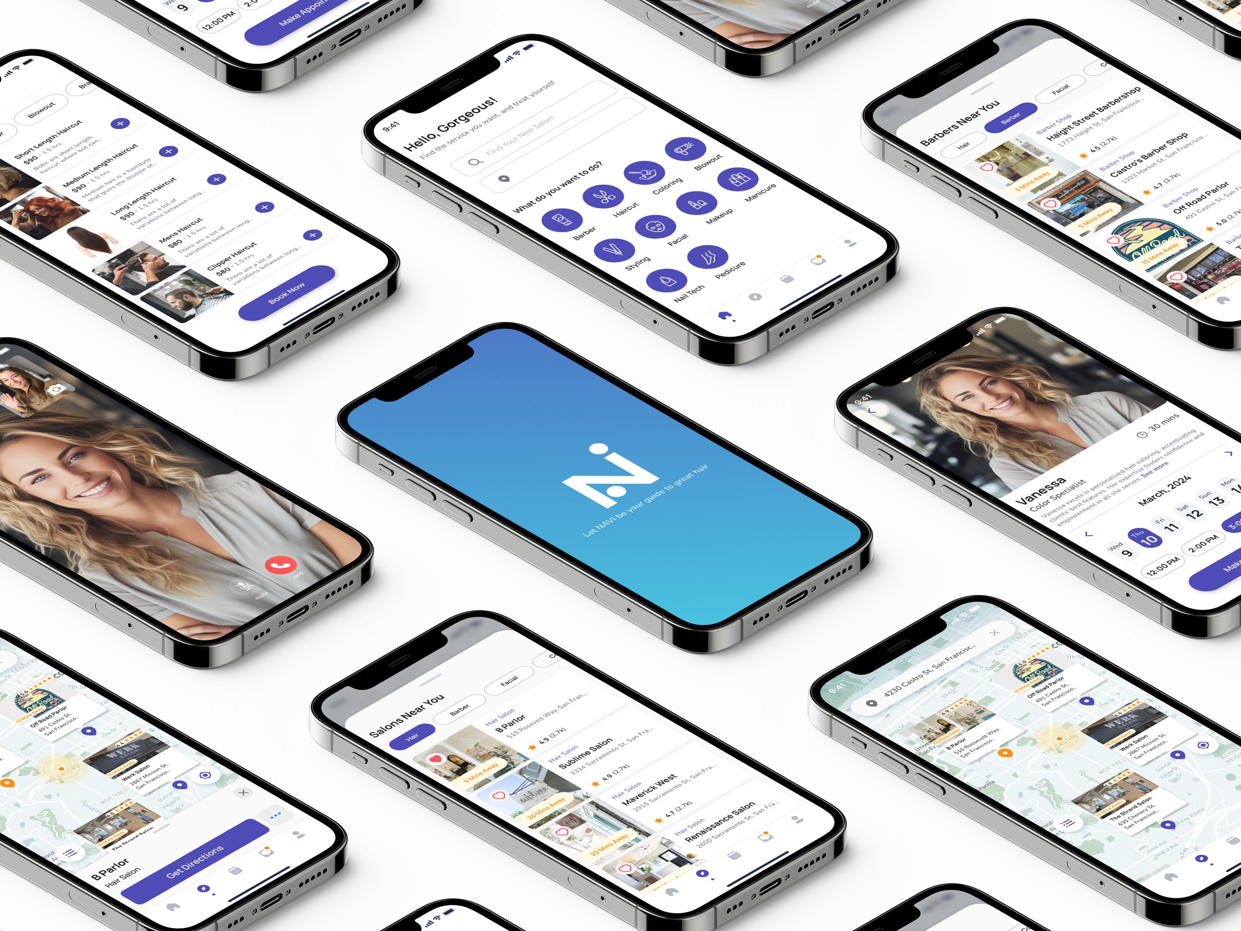
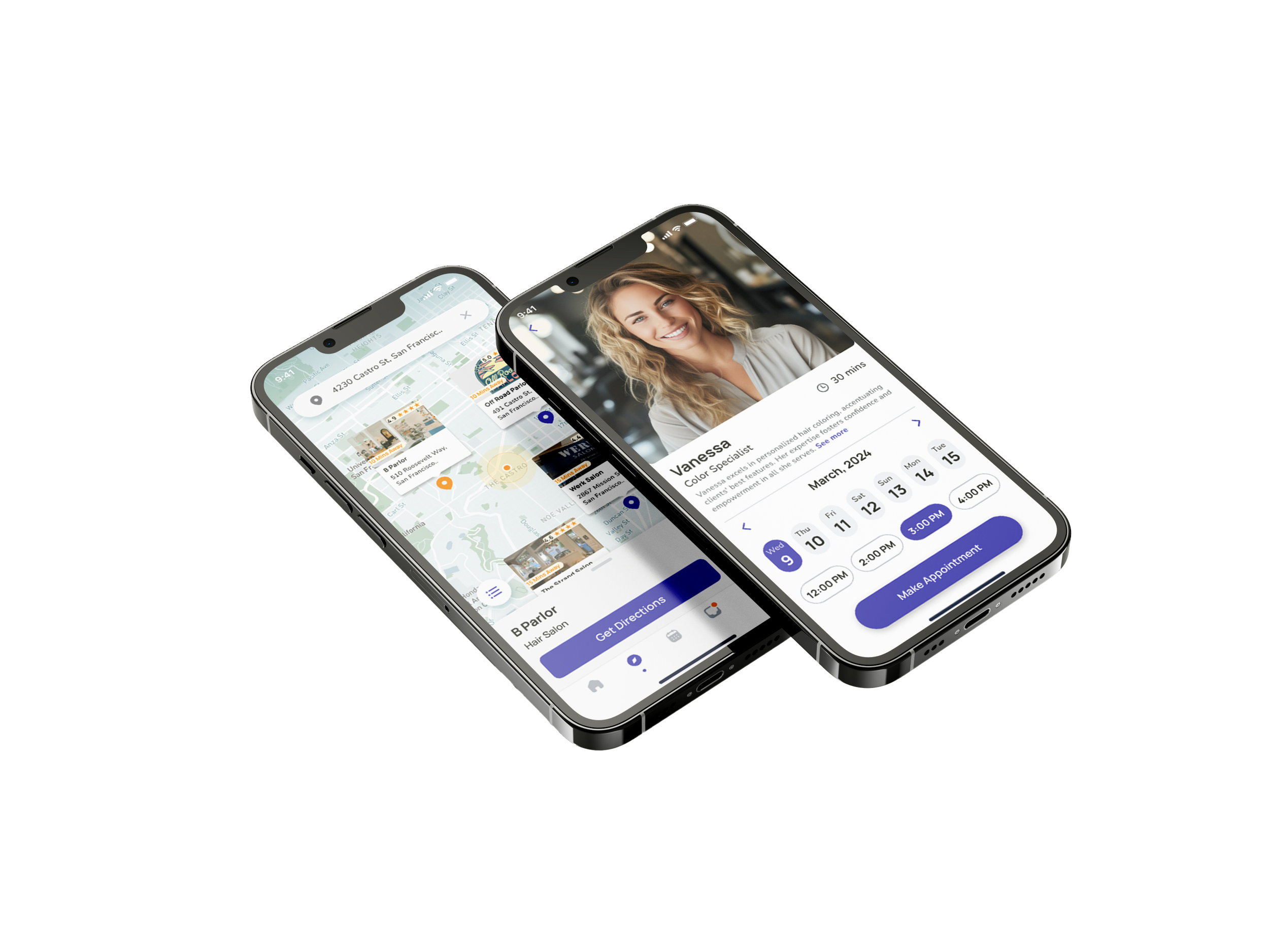
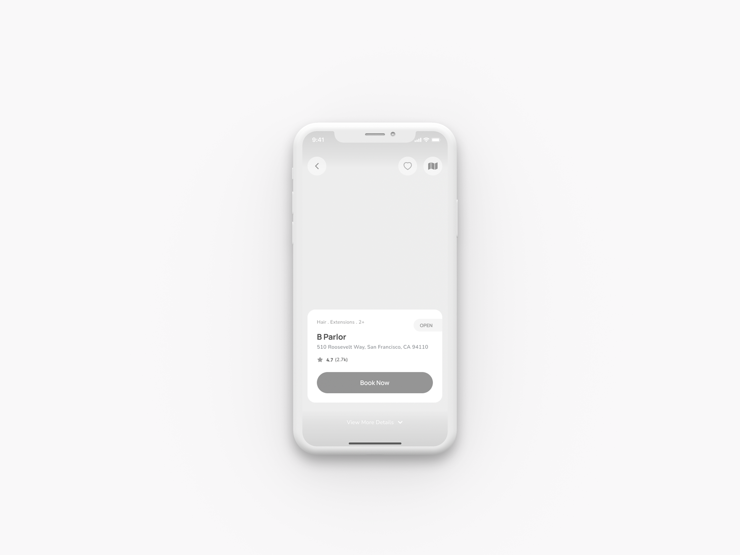
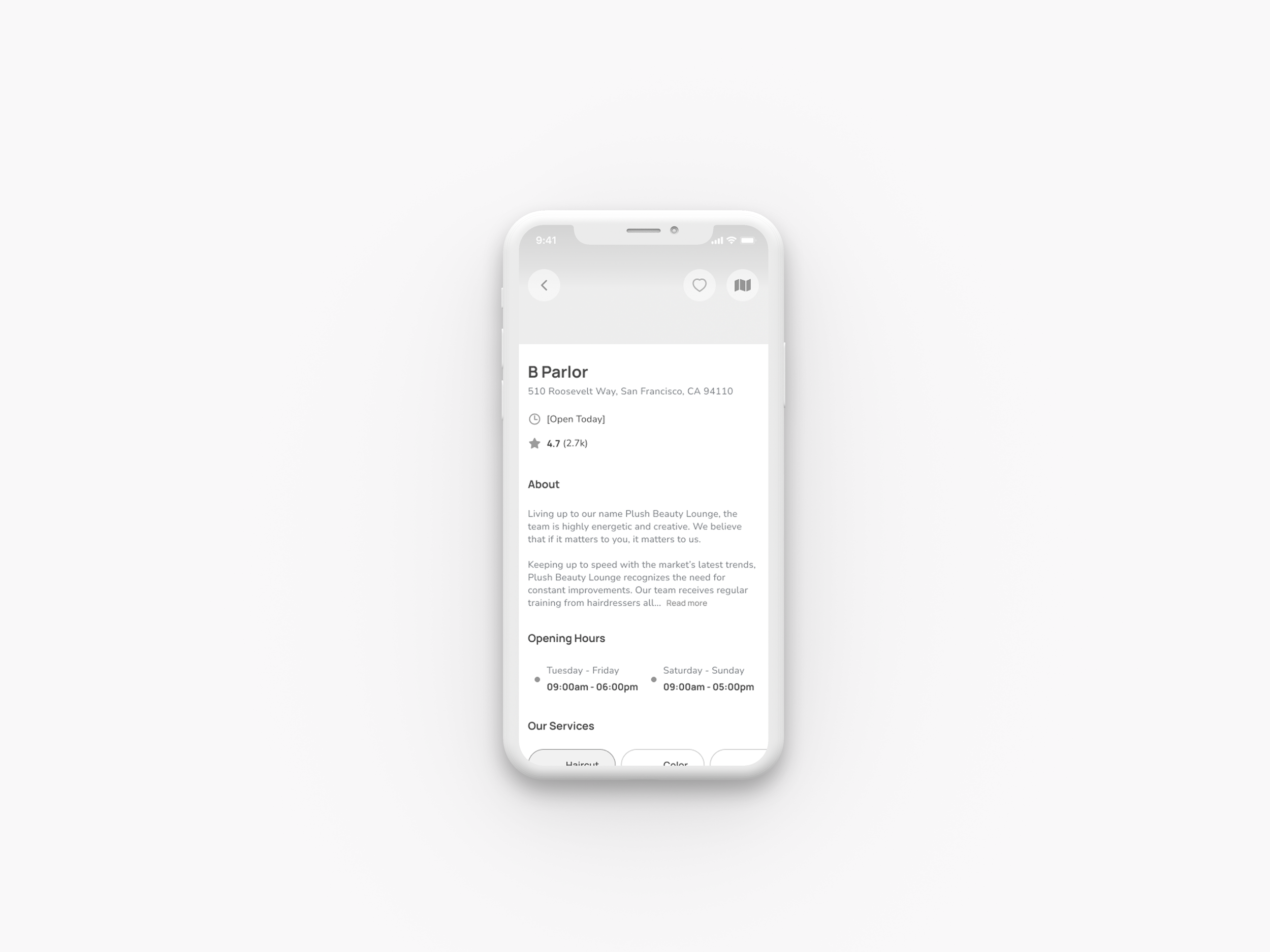
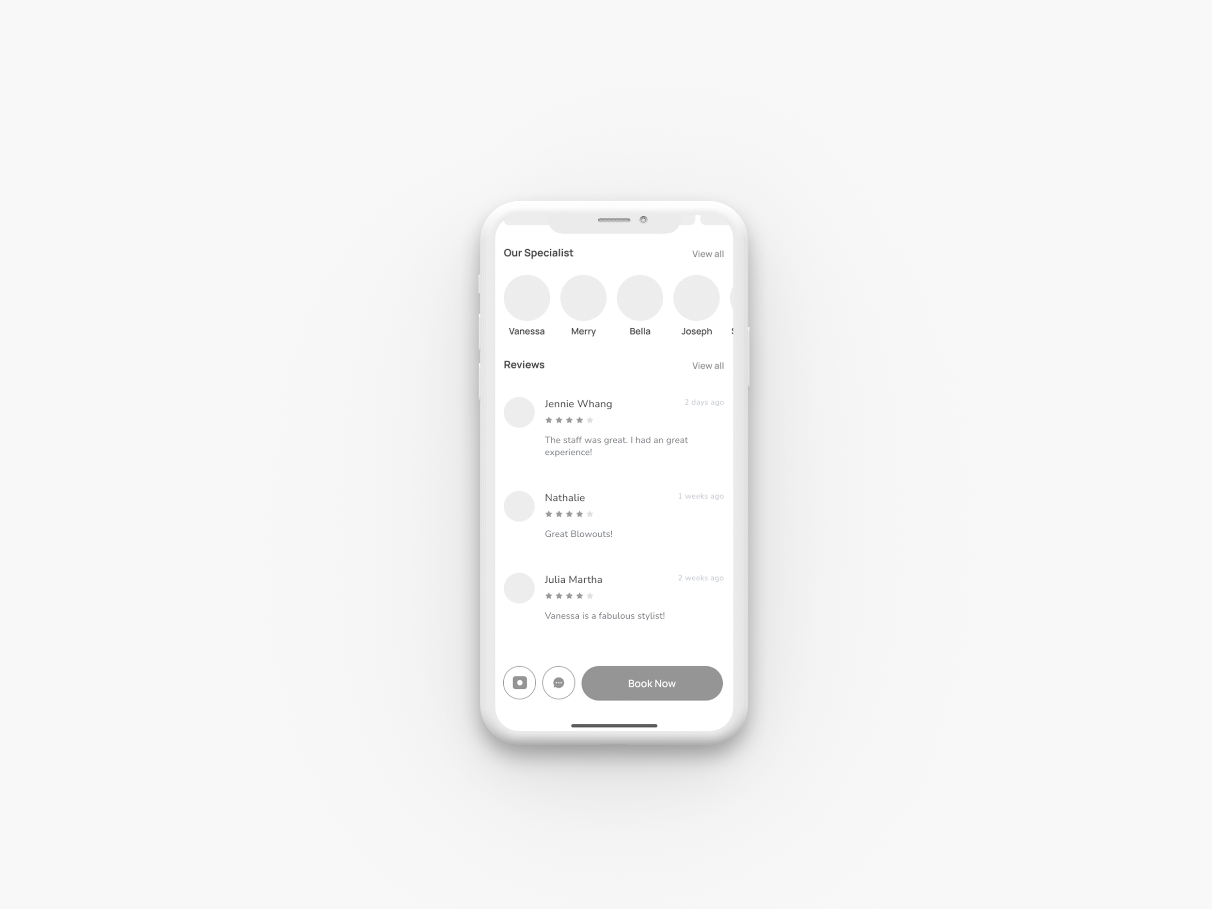
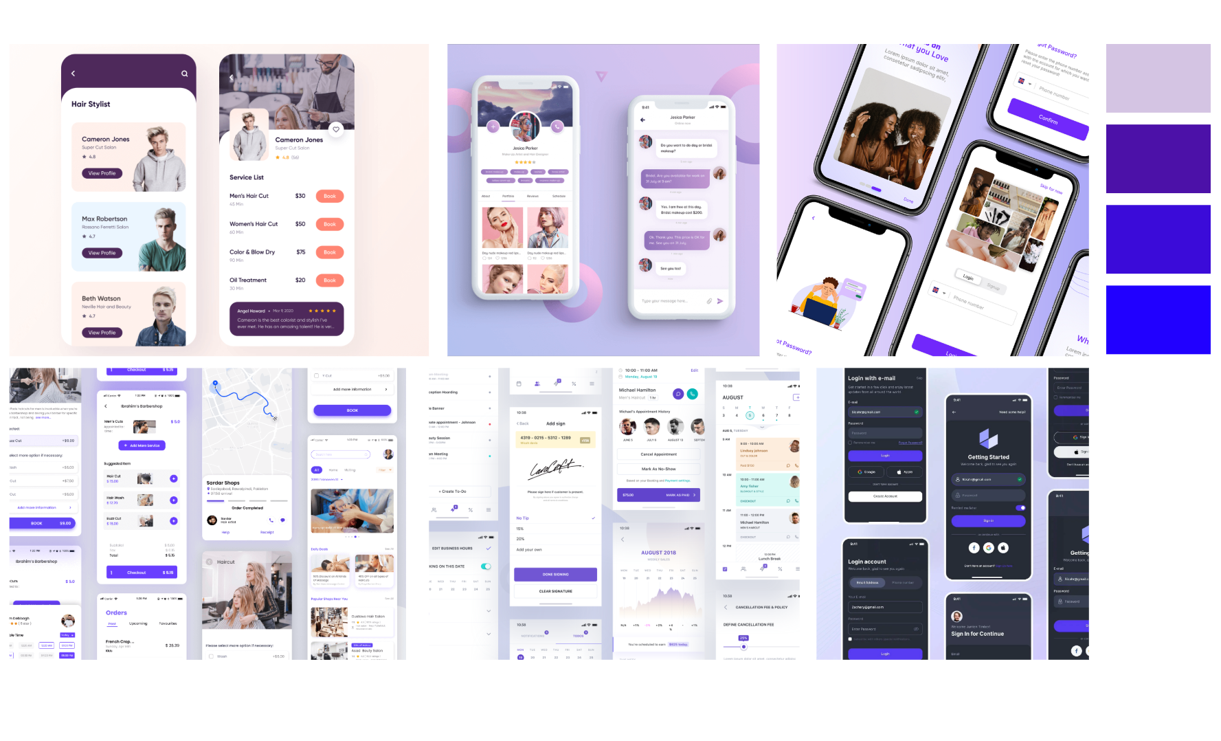
High Fidelity Screens
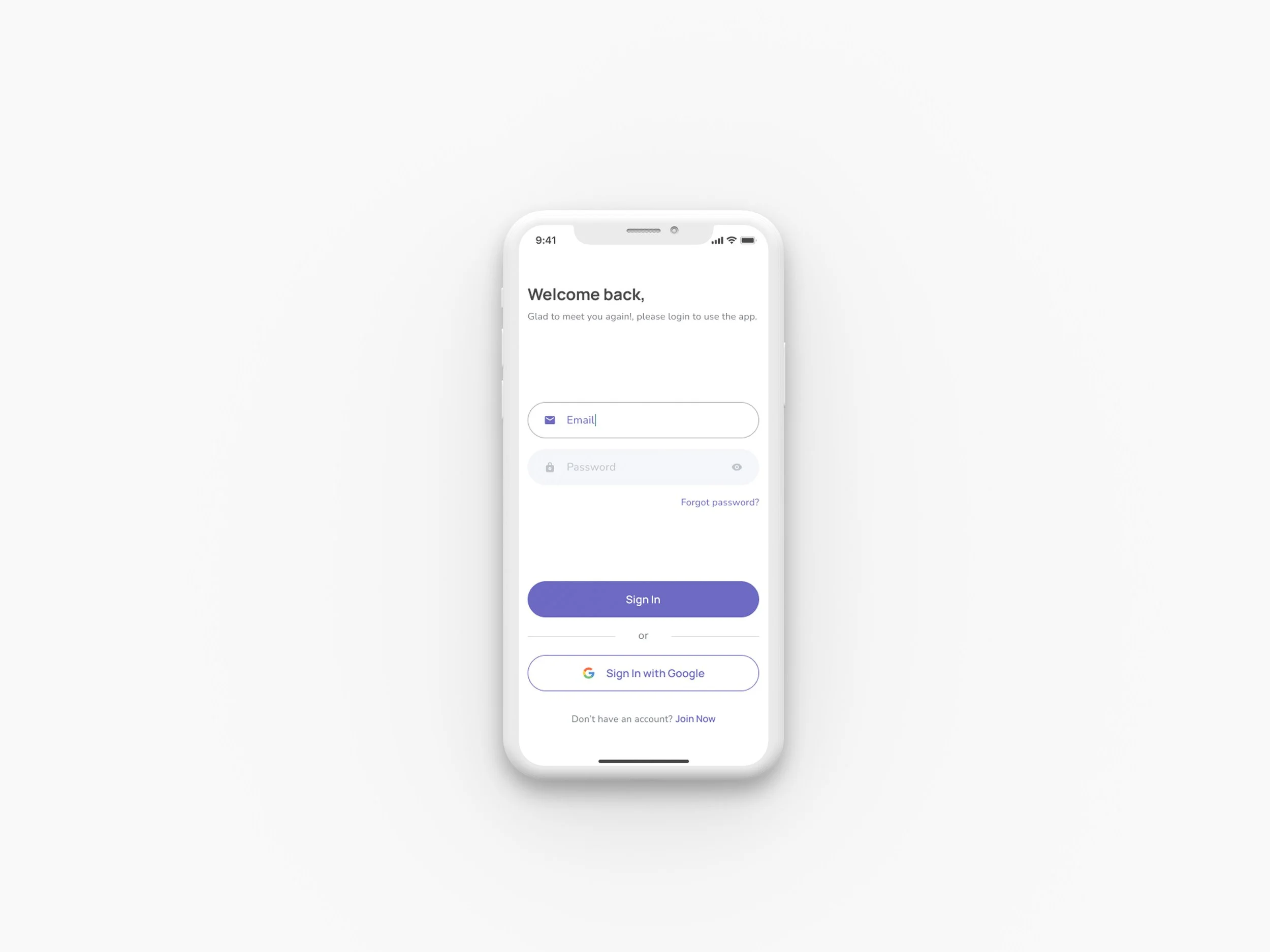
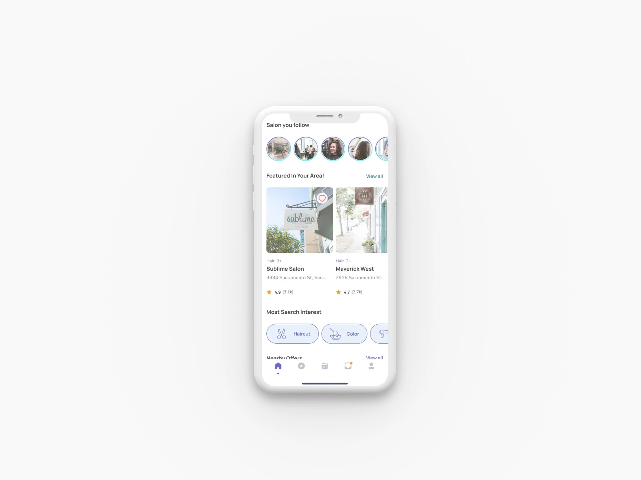
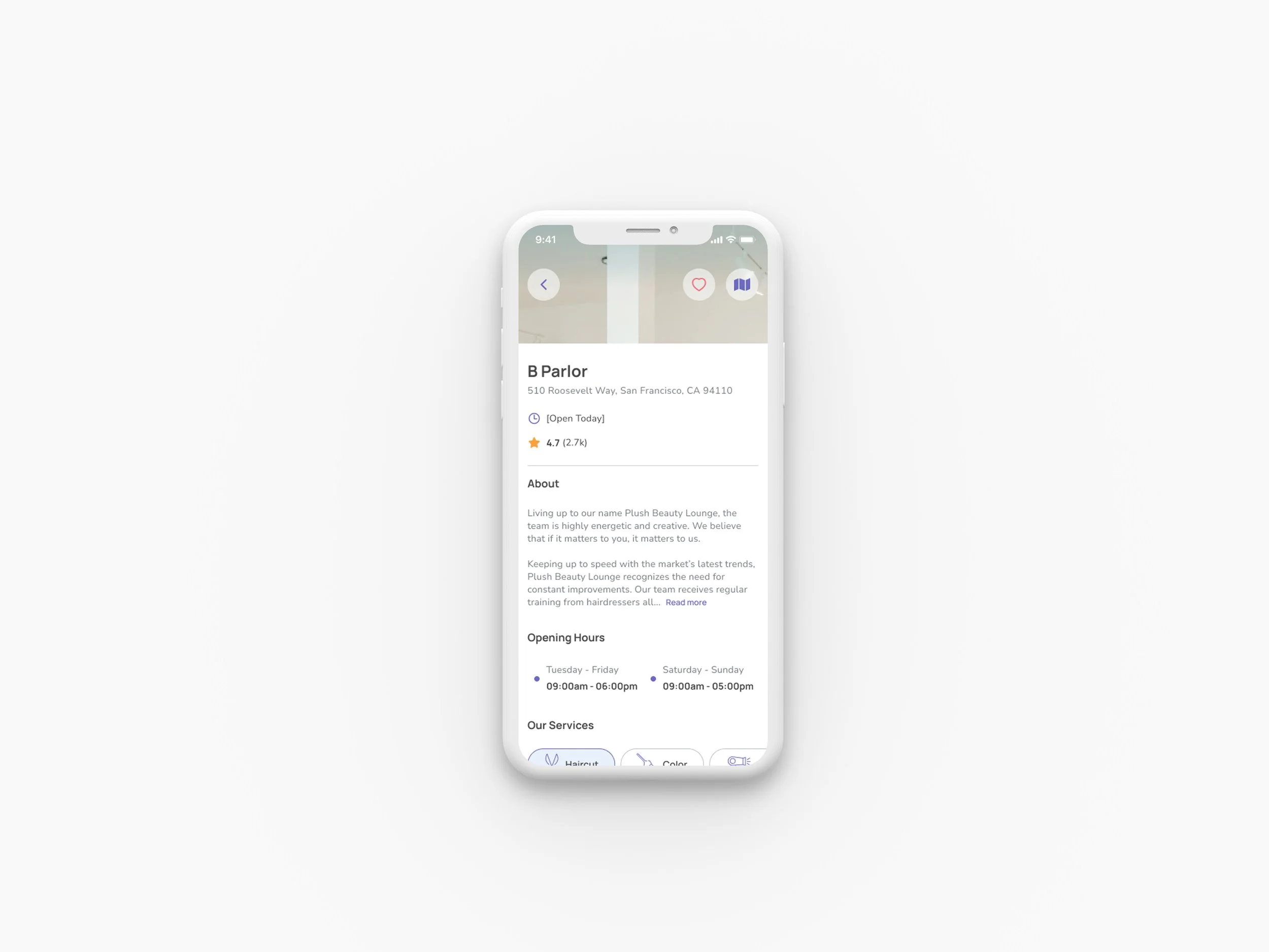
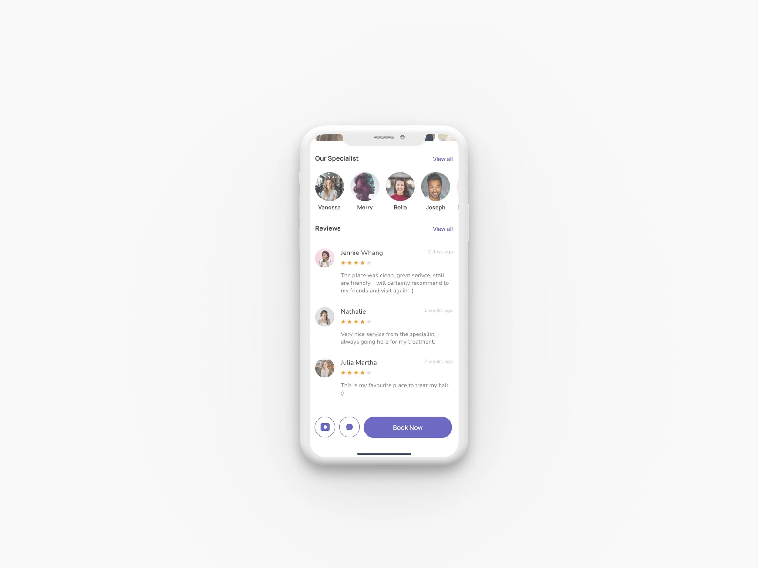
I used Figma to create prototypes for each critical task. After multiple iterations, I refined elements that were unclear or impaired the app's usability.
Prototype
Testing
04
Usability Testing
Before conducting user testing, I developed a usability testing plan that included scripts and scenarios. I carried out both remote and in-person testing. The users were introduced to the prototype through the Figma prototype.
User testing involved nine individuals, all females, with ages ranging from 24 to 38. The testing sessions lasted for thirty minutes.
The following scenarios were tested:
Scenario #1: You want to find a local salon in your area. Go to a place where you can find salons in your area.
Scenario #2: You need a specific service and are unsure if the closest salons can offer that service to you. Go to a place where you can find the service related to your needs.
Scenario #3: You have a busy schedule and cannot schedule a salon appointment. You need to find a professional that can meet your needs. Go to the place where you can schedule a virtual consultation.
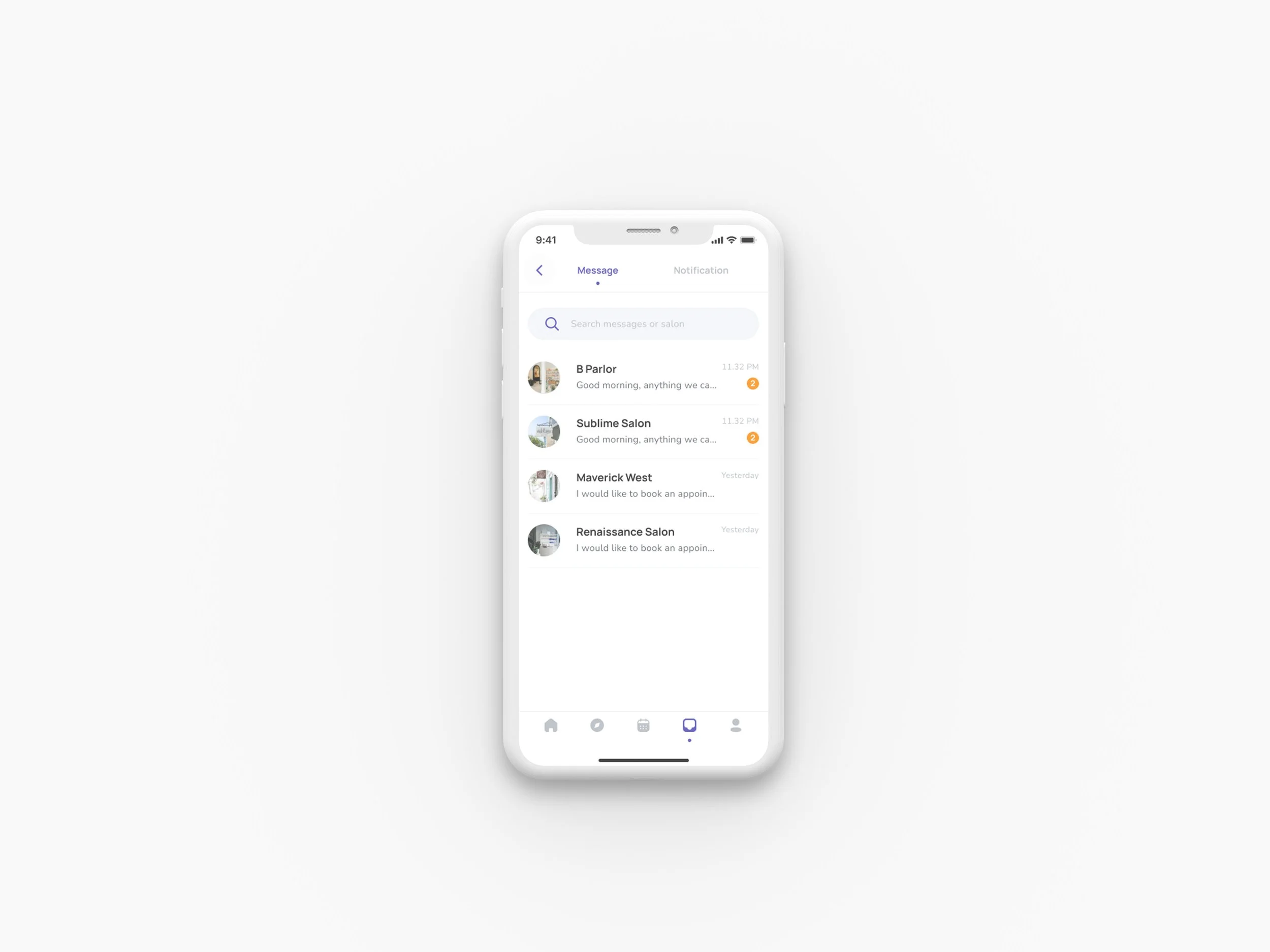
Scenario #4: You have a specific style in mind and photos of the exact style you want. Go to a place where you can send these photos via message to the salon.
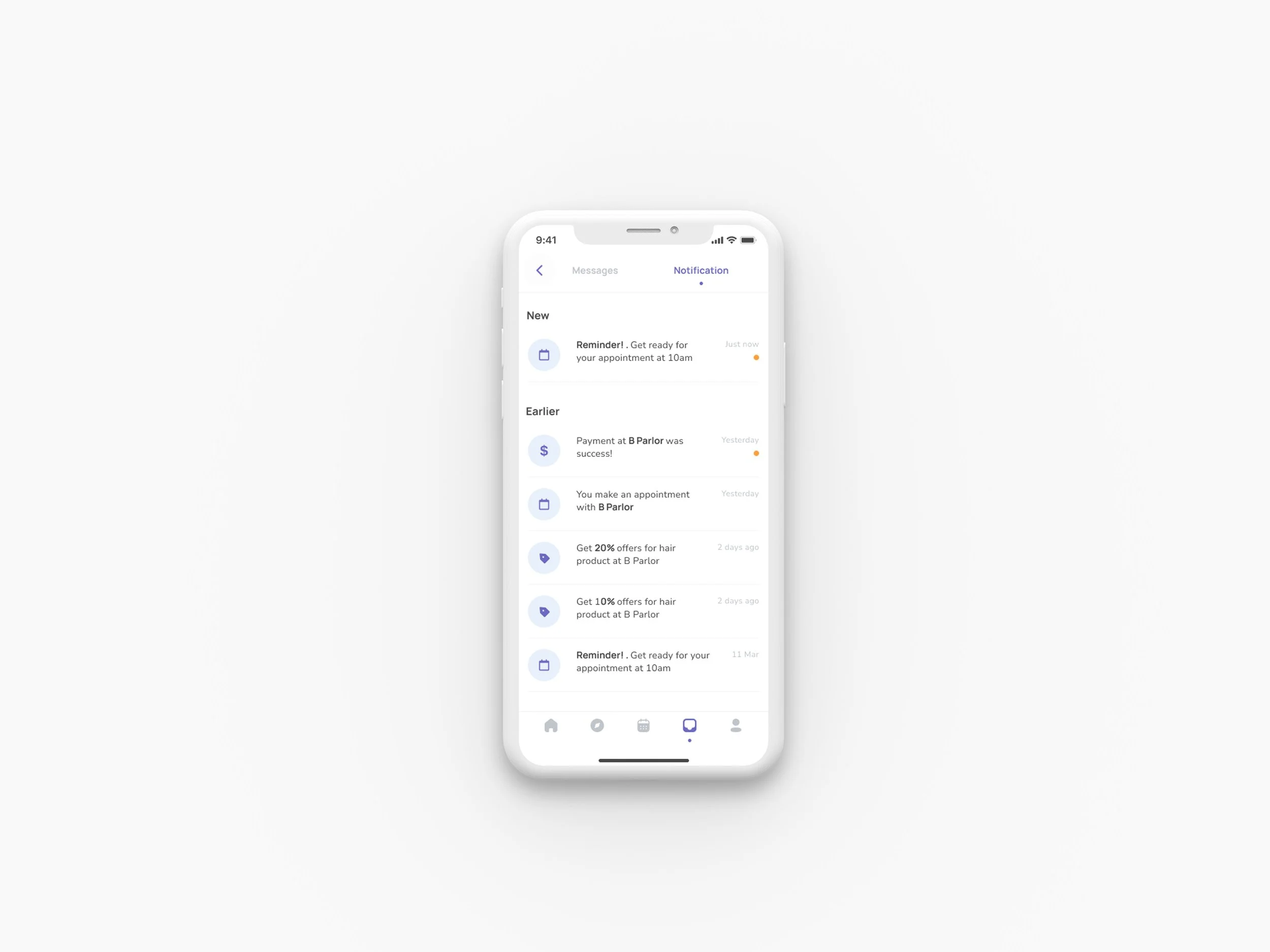
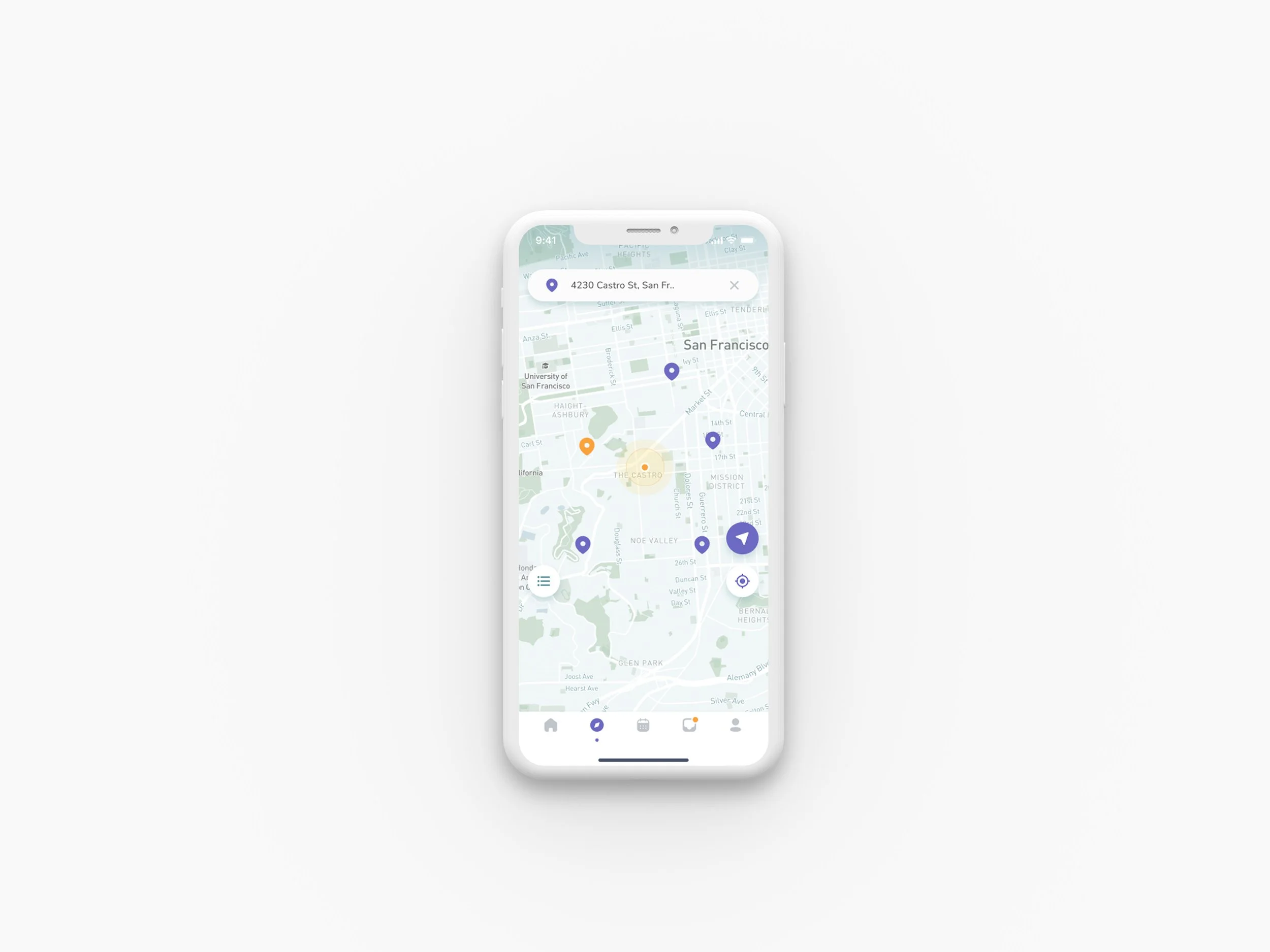
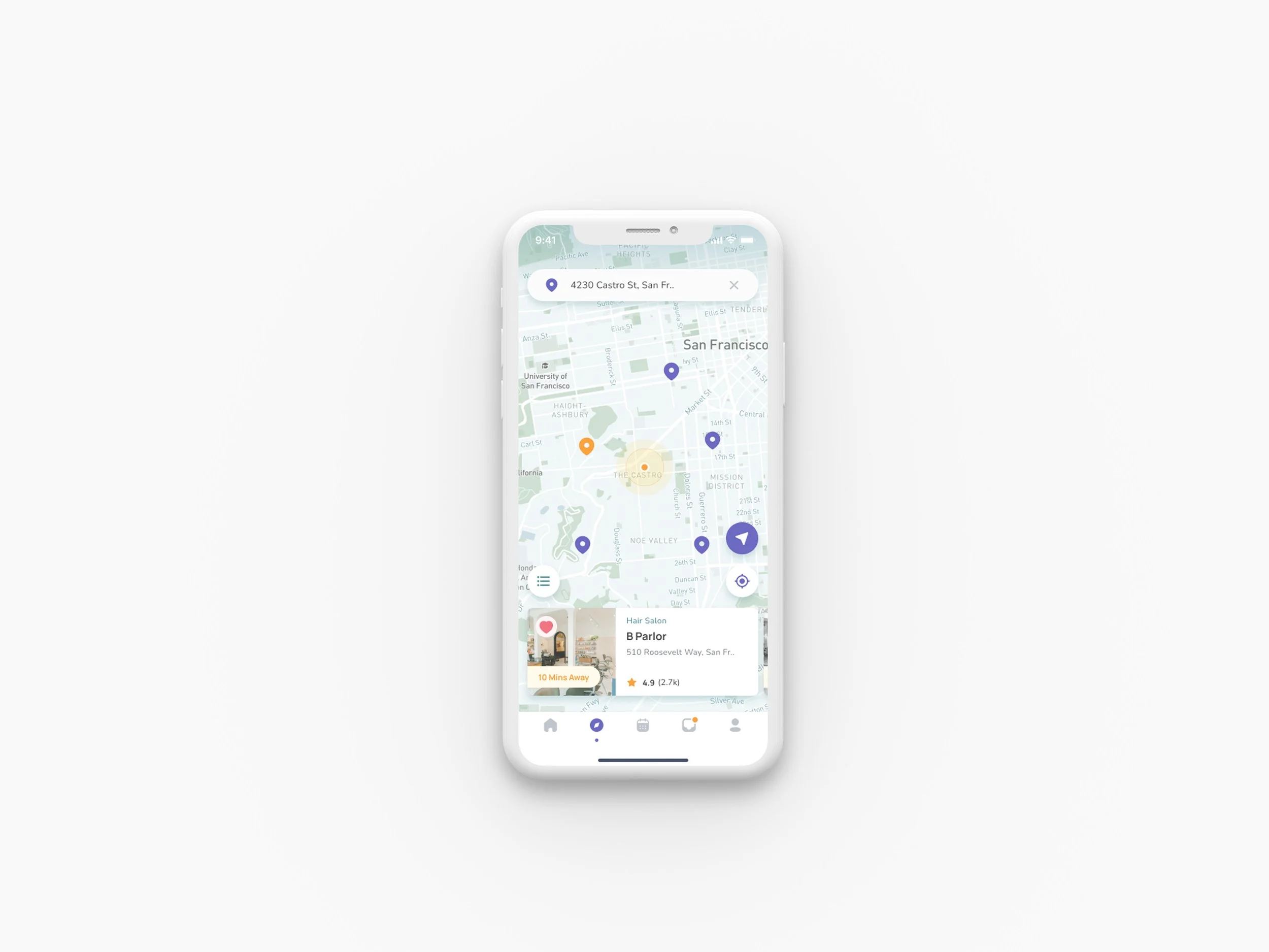
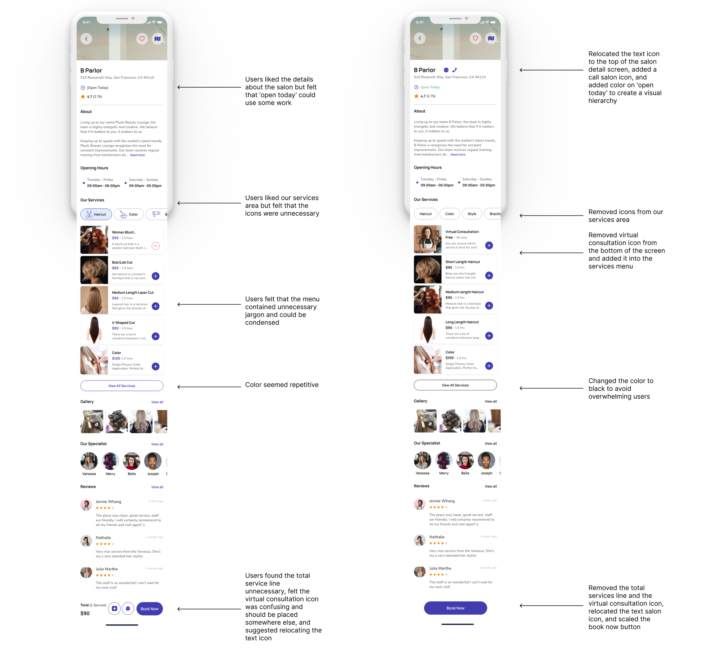
Issue 01
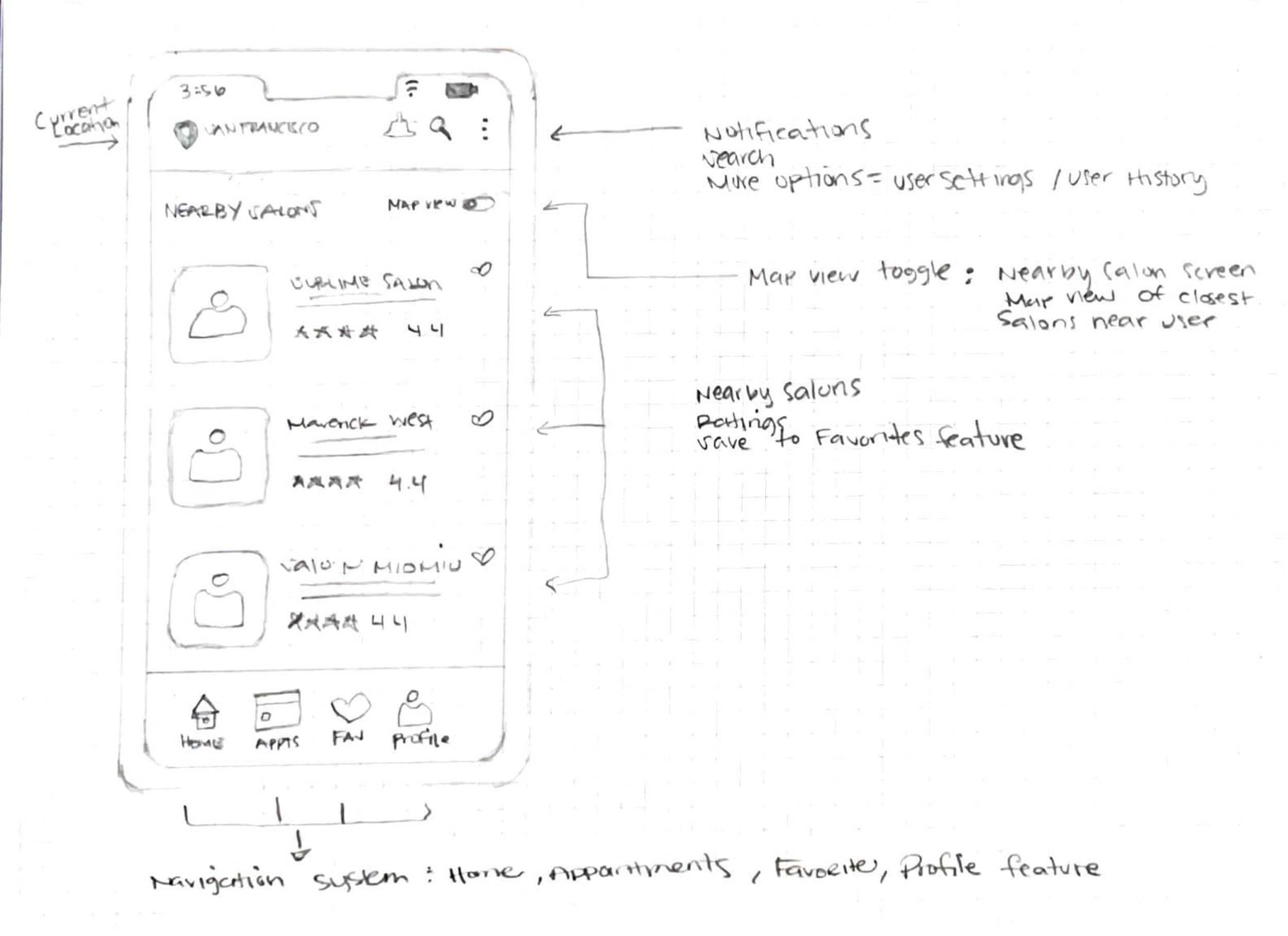
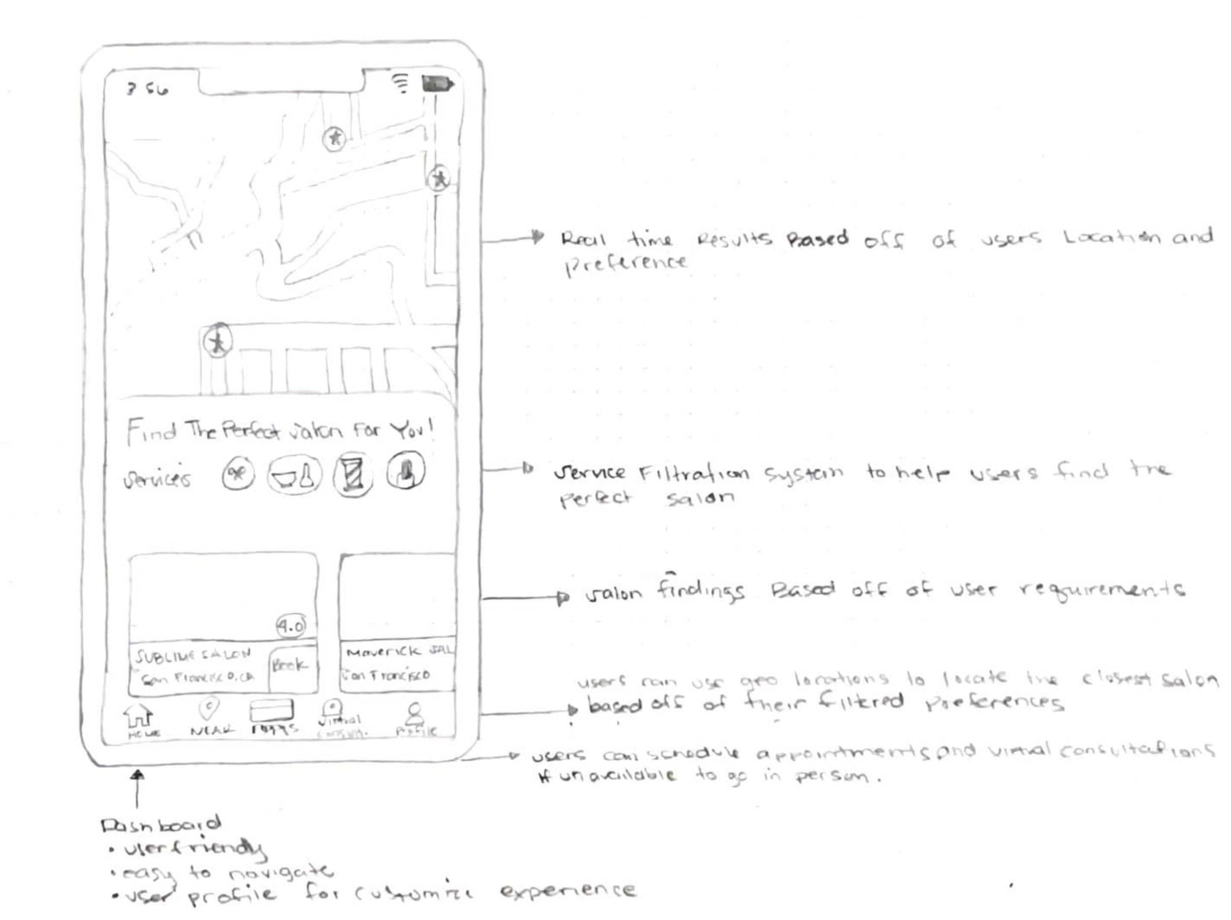
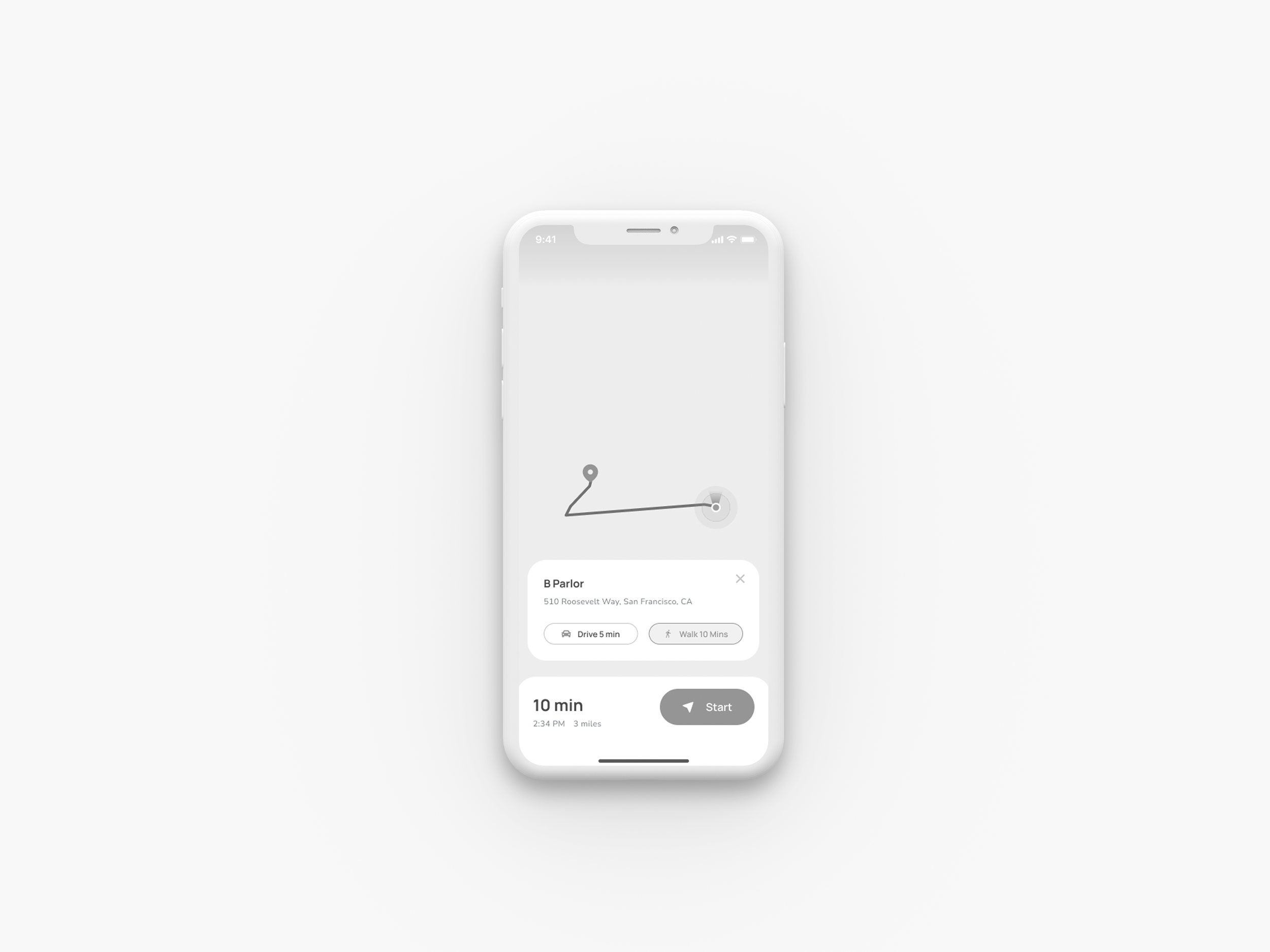
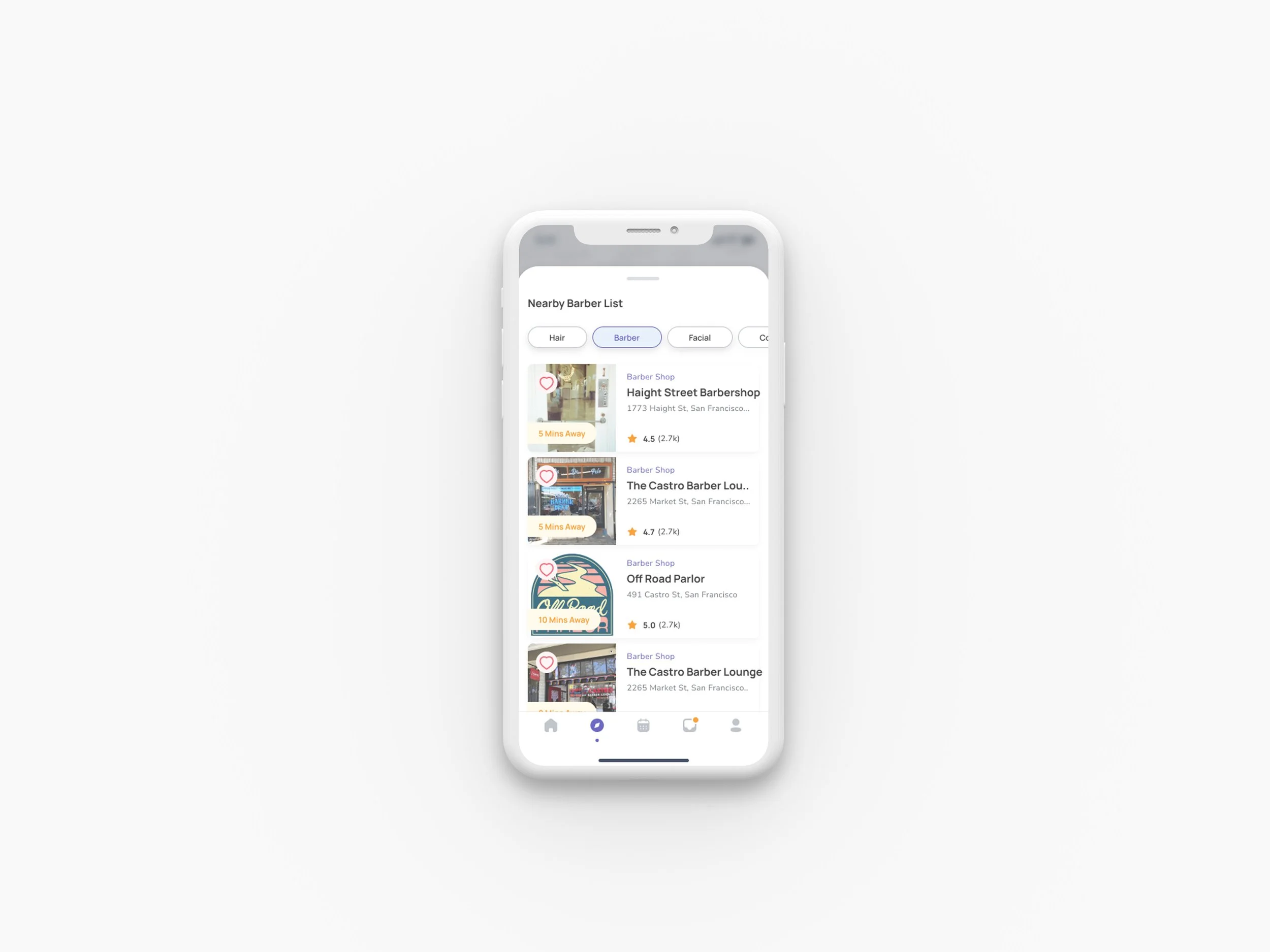
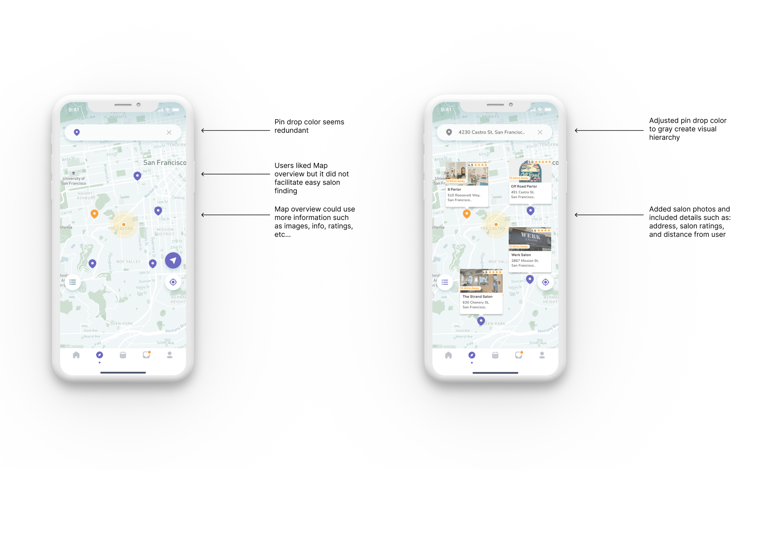
Map overview fails to facilitate easy salon discovery.
Summary:
6 users noted that the map screen's interface is confusing and fails to facilitate intuitive salon discover
3 mentioned that they would expect to see images with salon info of the closest salons to them.
Recommendations:
Remove the horizontal scroll card deck.
Add cards containing salon images, details, and ratings near the pin drop.
Add an accent color to the pin drop closest to the user.
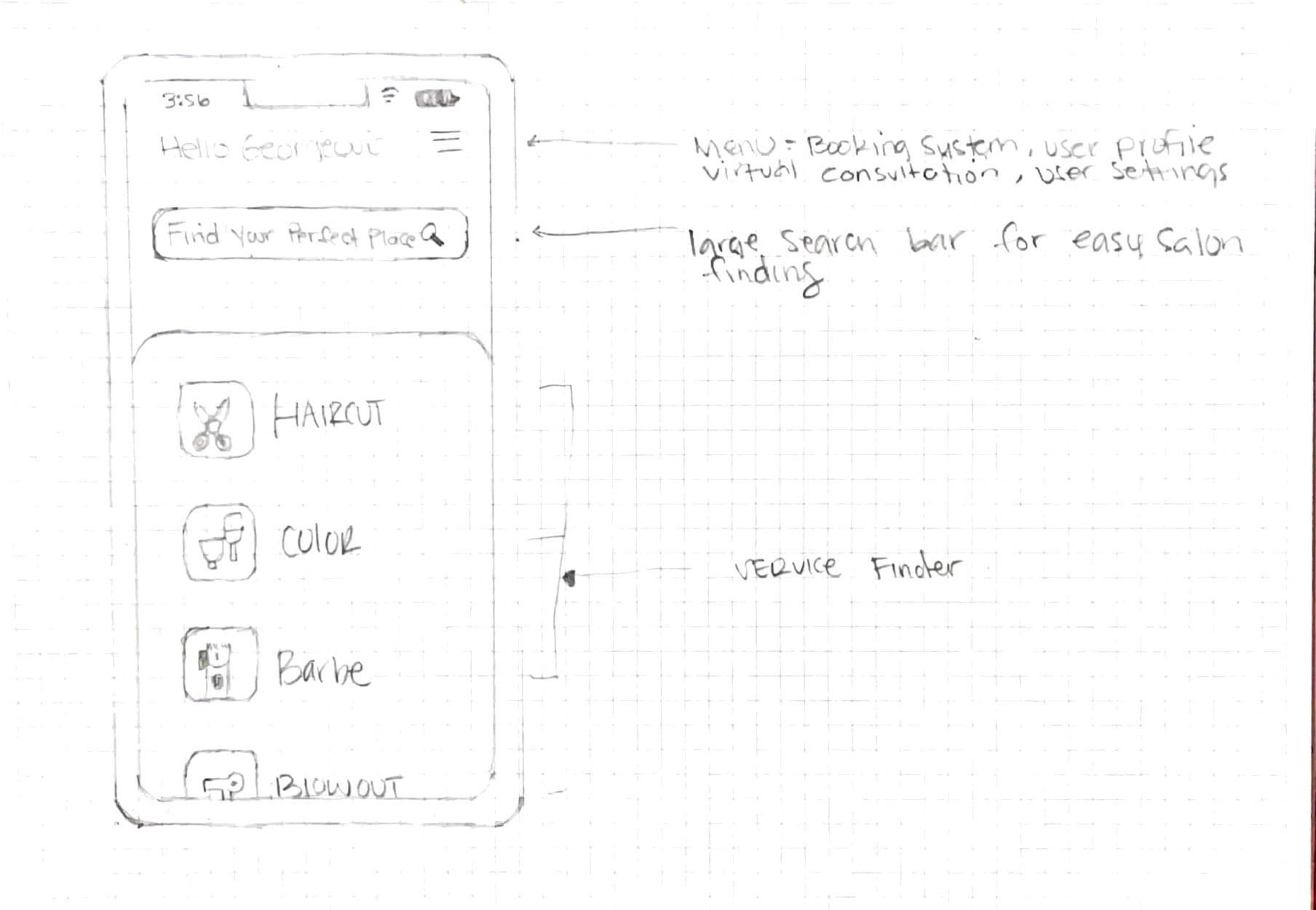
Issue 02
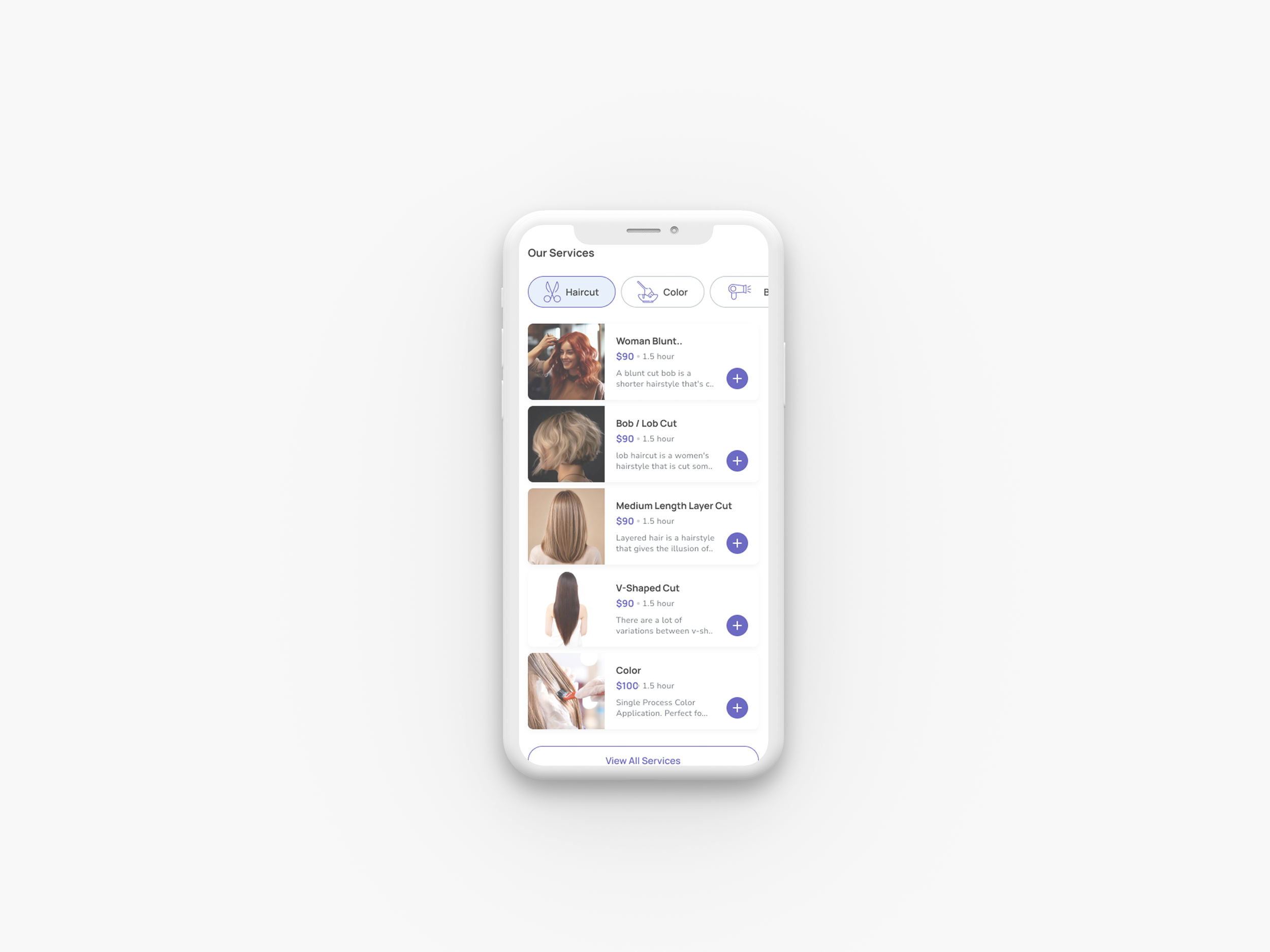
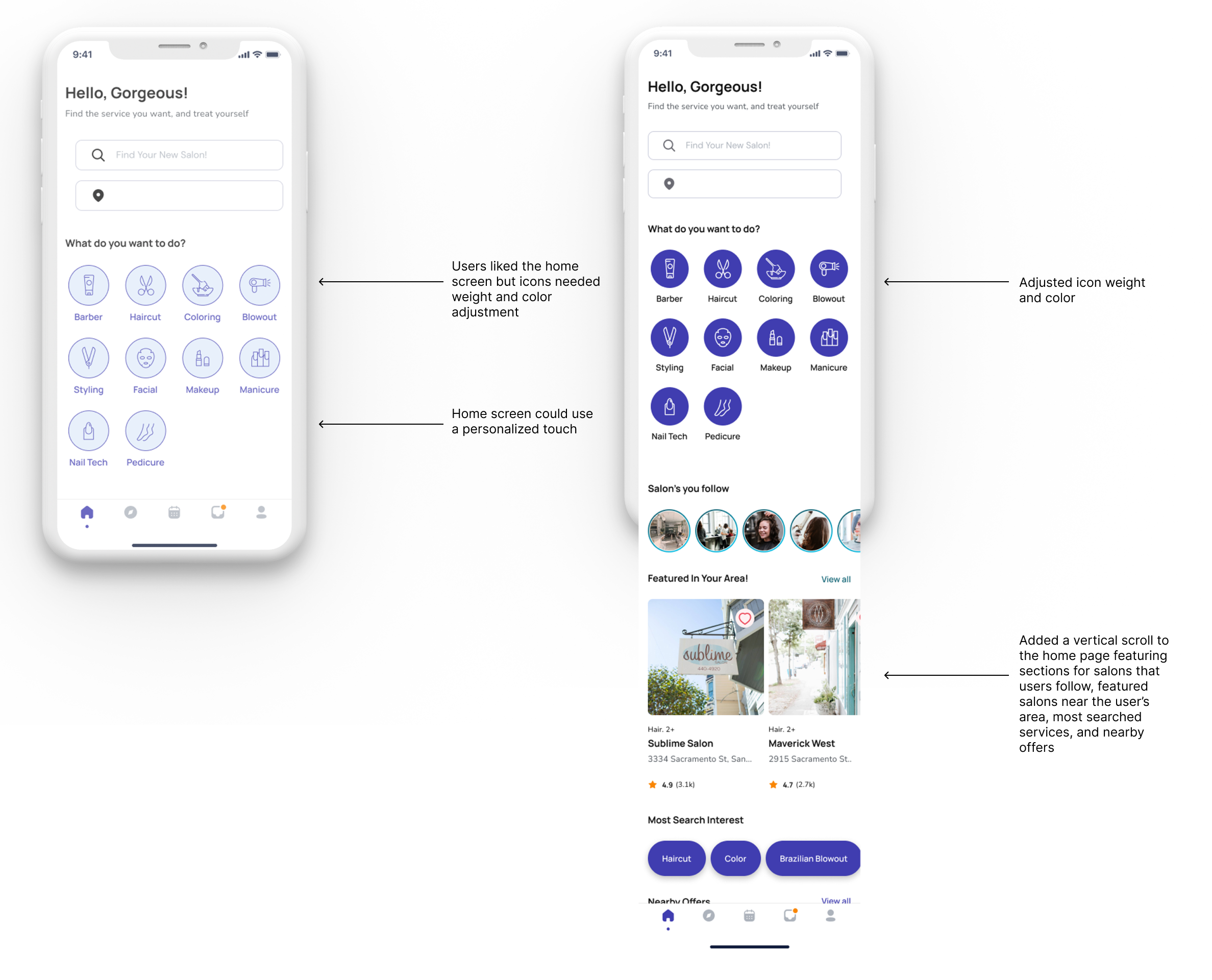
The iconography on the home screen lacks visual weight, which causes confusion and makes it easy for users to overlook.
Summary:
3 users overlooked the service icons and went straight to the map screen.
2 users thought the service icons were static and not icons.
Recommendations:
Adjust the color of the icons so that the buttons look selectable and not static.
Scale the icon and adjust the weight.
Issue 03
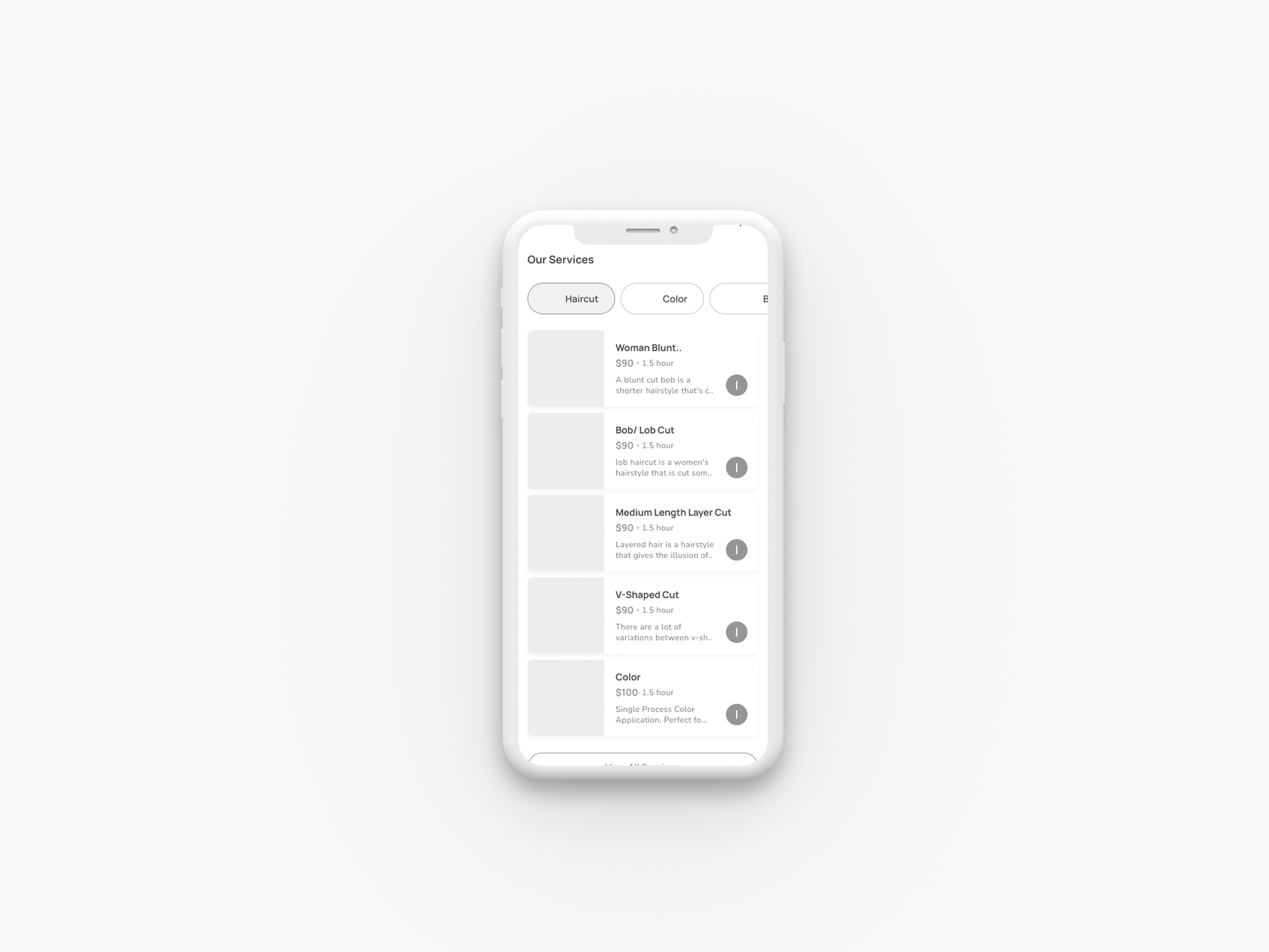
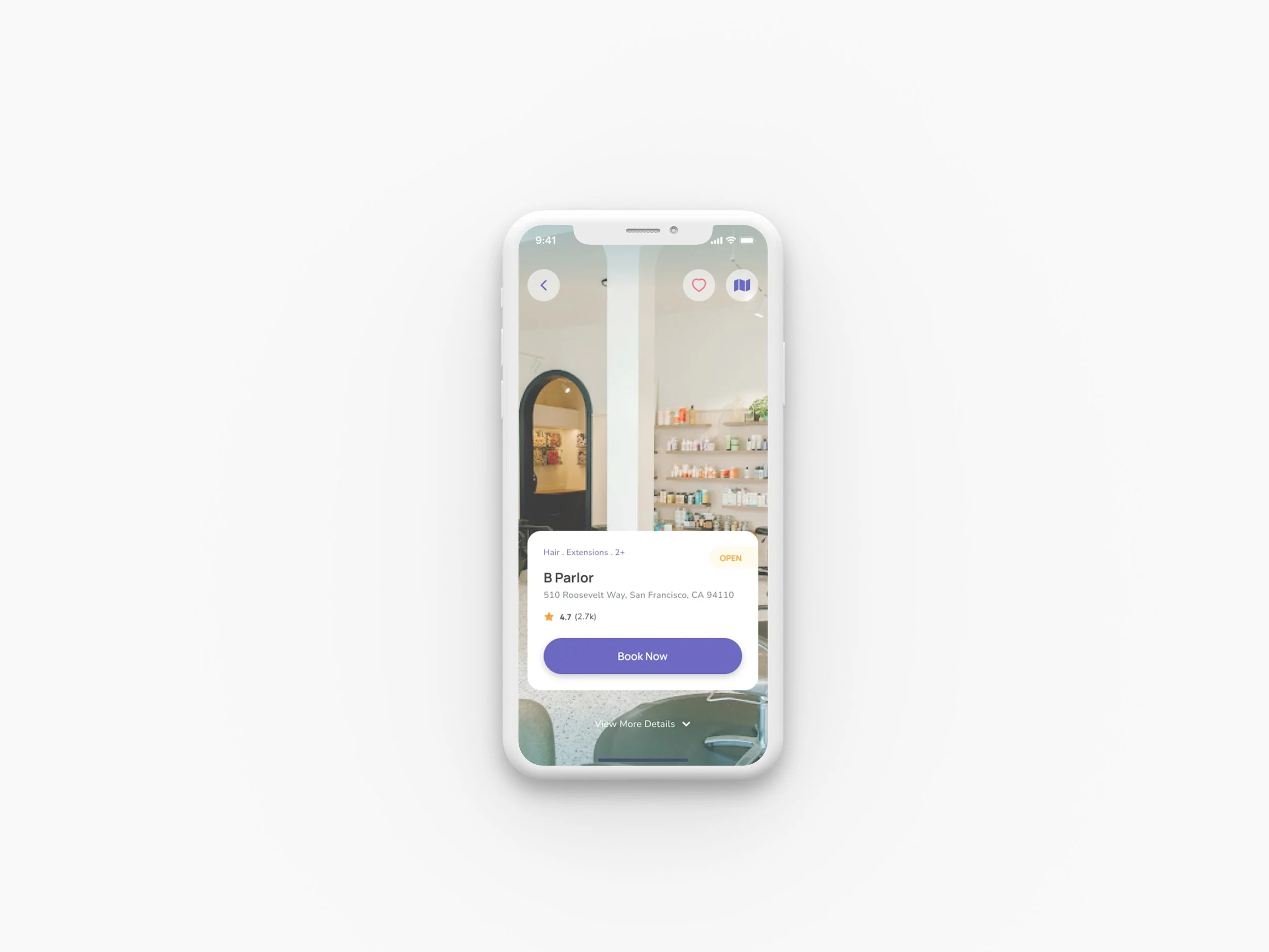
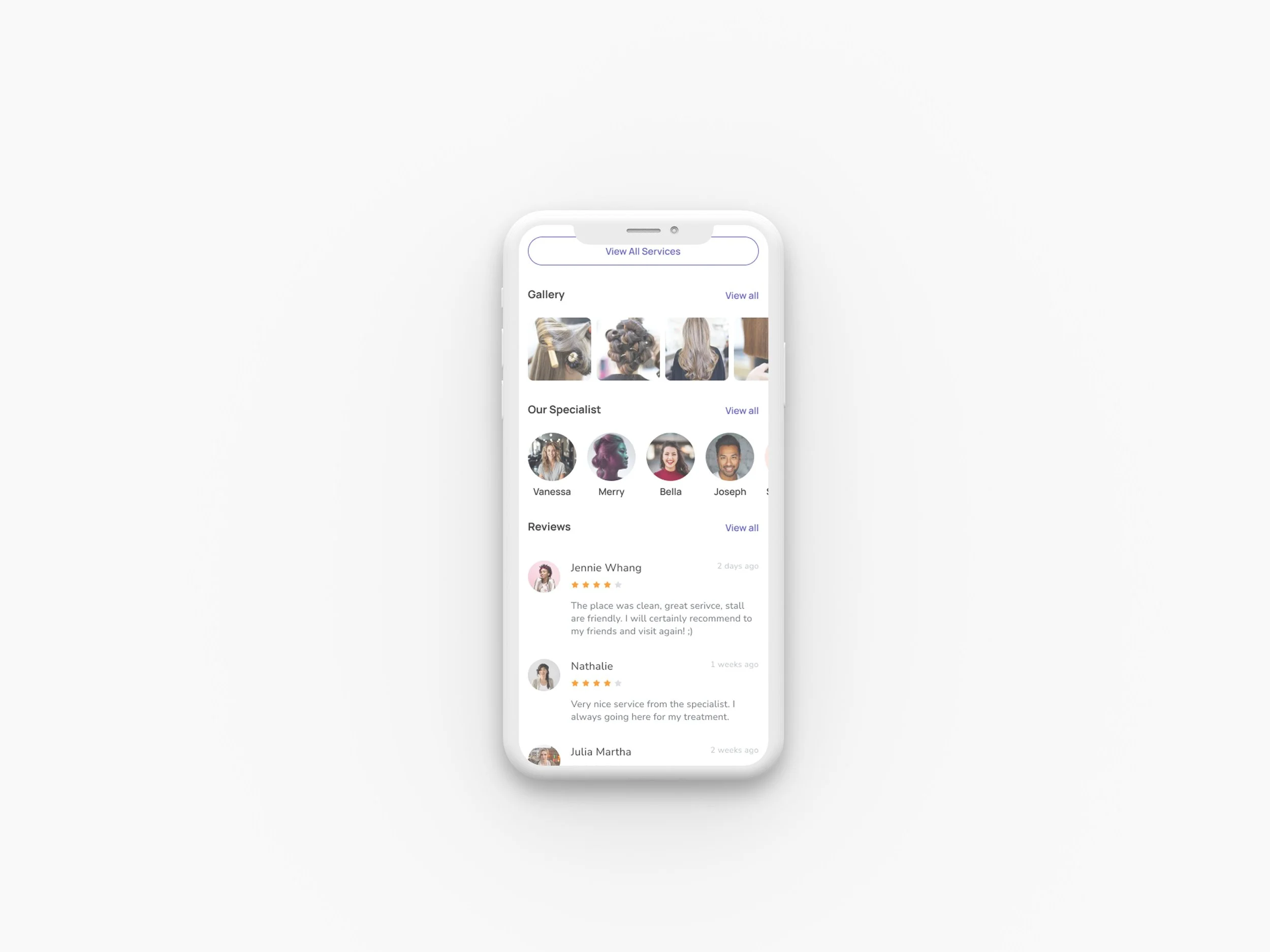
Virtual consultation service is unclear on the salon screen.
Summary:
3 users noted the absence of a virtual consultation option in the service menu.
3 users stated that virtual consultation icon is confusing are not visible enough.
Recommendations:
Remove the virtual consultation icon from the salon screen.
Add virtual consultation to the service menu on the salon screen.
Add available stylists to the virtual consultation service with availability.
Reflection
05
I've learned a lot from this project. It emphasized the importance of user feedback and iterative design, as well as the value of simplicity, clarity, and user engagement. The changes made, such as simplifying the interface and adjusting elements based on user feedback, significantly improved the app's usability and visual hierarchy. This experience reinforced my belief in the iterative nature of design and the power of user-centered design. I'm excited to apply these insights to future projects, focusing on creating designs that solve problems.